
Shopify Checkout Optimization: 7 Changes to Test for More Sales
- William Prud'homme
- Jul 19, 2025
- 27 min read

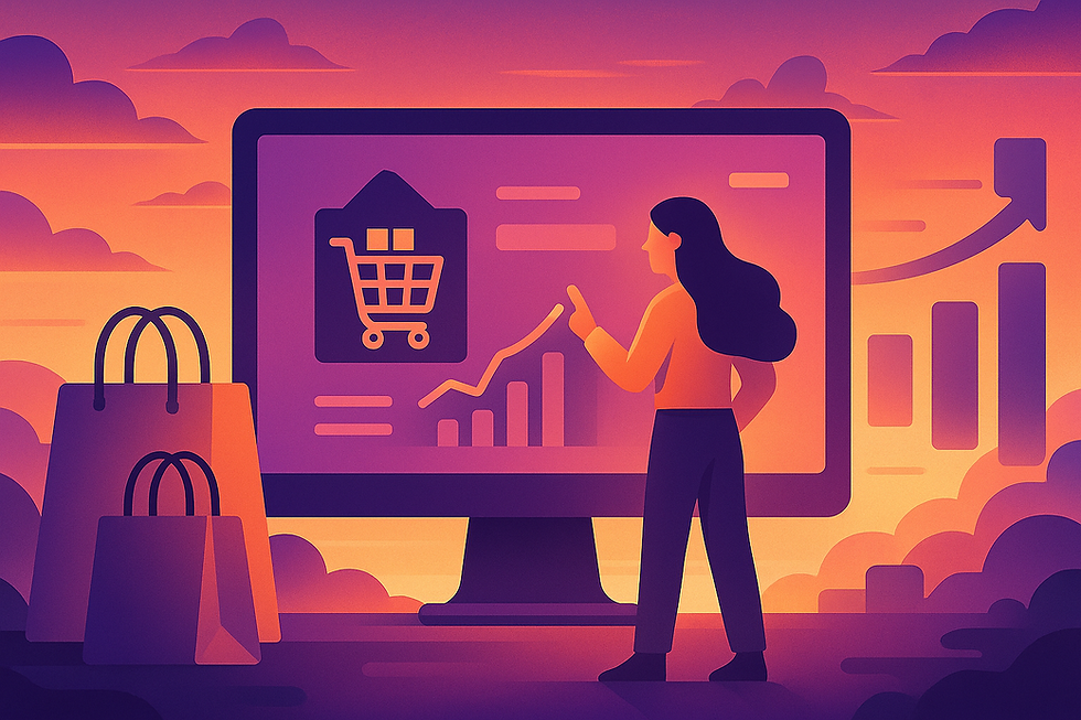
The $260 Billion Problem and the New Checkout Frontier
In the world of ecommerce, few areas hold as much untapped potential and hidden risk as the checkout page. It is the final, critical step in the customer journey, where interest transforms into revenue. Yet, for the majority of online stores, it is also the leakiest part of the sales funnel. The numbers are staggering: across all industries, the average cart abandonment rate hovers at a breathtaking 70%.1 This means for every ten customers who show clear purchase intent by adding a product to their cart, seven will leave without completing the transaction.
This isn't a minor operational inefficiency; it's a colossal loss of revenue. According to research from the Baymard Institute, ecommerce brands lose an estimated $260 billion in recoverable sales each year due to checkout friction alone.4 This data reveals a crucial truth: a significant portion of cart abandonment is not a natural consequence of "window shopping." It is a direct result of a poorly designed or frustrating checkout experience. Customers abandon their carts due to solvable problems—unexpected costs, forced account creation, and processes that are simply too long or complicated.4
For Shopify merchants, this challenge is now coupled with a fundamental technological shift. The era of customizing the checkout through direct code edits in the checkout.liquid file is ending. Shopify is phasing out this legacy system, with checkout.liquid already deprecated for the Information, Shipping, and Payment steps. The final sunset for its use on the Thank You and Order Status pages is set for August 28, 2025, for Shopify Plus merchants.6
This transition to a new framework called Checkout Extensibility represents a paradigm shift. Instead of risky, maintenance-heavy script injections, customizations are now handled through secure, stable, and faster app-based UI extensions.7 While this change requires merchants to adapt, it presents a golden opportunity. The mandatory migration forces a re-evaluation of the entire checkout process. This is the perfect moment to move beyond simply replicating old customizations and instead, strategically re-engineer the checkout for maximum conversion. This guide provides a data-backed roadmap for that journey, outlining seven high-impact changes every Shopify merchant should be A/B testing in this new era of checkout optimization.
Table: The Anatomy of an Abandoned Cart: Top Reasons Shoppers Leave (2025 Data)
To effectively optimize the checkout, one must first understand the primary drivers of abandonment. The following table summarizes the most common reasons customers leave during the checkout process, providing a clear diagnostic of the problems that need to be solved.
Reason for Abandonment | Percentage of Shoppers | Key Source(s) |
Extra Costs Too High (Shipping, Tax, Fees) | 39% - 48% | 4 |
Forced to Create an Account | 19% - 24% | 1 |
Too Long / Complicated Checkout Process | 18% - 22% | 1 |
Didn't Trust the Site with Credit Card Info | 17% - 19% | 4 |
Delivery Was Too Slow | 21% | 4 |
Couldn't See Total Order Cost Up-front | 14% - 21% | 4 |
Change #1: The Friction-Free Foundation — Testing Guest Checkout & Minimalist Forms
The Problem & The Psychology: The Burden of Unnecessary Work
One of the most significant and easily avoidable friction points in any checkout process is the mandatory creation of a customer account. Data consistently shows that forcing users to register before they can buy is a conversion killer, causing up to 24% of shoppers to abandon their purchase.1 This requirement introduces a substantial psychological barrier at the moment when a customer's motivation is high but their patience is at its thinnest.
This friction stems from two core psychological principles: cognitive load and decision fatigue.15 Cognitive load refers to the amount of mental effort required to complete a task.
Every form field, every password requirement, and every decision adds to this load. When the perceived effort outweighs the desire for the product, abandonment becomes the path of least resistance. This is compounded by "account fatigue," a modern phenomenon where users are weary of creating and remembering unique login credentials for every website they transact with.17 A request to create an account feels less like a convenience and more like a long-term commitment they are not yet ready to make.
The 2025 Shopify Solution (Implementation)
The solution is to remove this barrier entirely by prioritizing speed and simplicity. This involves not only enabling guest checkout but also critically auditing and minimizing the information requested.
Enable Guest Checkout: This should be the default setting for nearly every Shopify store. It is the single most effective way to reduce friction for new customers. This setting can be found in the Shopify admin under Settings > Checkout > Customer accounts. Merchants should select the "Accounts are optional" setting.18
Audit and Minimize Form Fields: The goal is to ask only for the information that is absolutely essential to process and ship the order. Every extra field is another potential reason for a user to drop off.
Company Name: Unless the store is primarily B2B, this field should be hidden or made optional.
Address Line 2 (Apartment, suite, etc.): This field can be confusing and is often unnecessary. It should be made optional or, for an even cleaner look, hidden behind an "Add apartment, suite, etc." link.12
Full Name Field: Using a single field for "Full Name" instead of separate "First Name" and "Last Name" fields reduces the number of taps or clicks required.1
These form options can be configured in the Shopify admin under Settings > Checkout > Customer information.5
Structuring Your A/B Test: The "$300 Million Button" Test
The impact of removing forced registration is so profound that it led to one of the most famous case studies in ecommerce. A major retailer, widely reported to be Amazon, famously increased its annual revenue by an estimated $300 million simply by replacing a "Register" button with a "Continue as Guest" option. The change resulted in a 45% increase in the number of customers completing purchases.20 This test can be replicated on any Shopify store.
Hypothesis: By offering a prominent guest checkout option instead of forcing account creation, we will reduce checkout abandonment and increase the overall conversion rate because we are removing a significant friction point for new customers.
Control (A): In Shopify checkout settings, set customer accounts to "Required."
Variant (B): Set customer accounts to "Optional," ensuring the "Continue as Guest" or similar path is the most visually prominent choice for users.
Primary KPI: Checkout Completion Rate.
Secondary KPIs: Time-to-purchase, new customer conversion rate, cart abandonment rate.
The perceived conflict between the marketing team's desire for customer data (via accounts) and the user's desire for a fast, frictionless experience is often a false choice. The optimal strategy, which should be tested, is to decouple the purchase from the registration. Allow the customer to check out as a guest first, securing the sale. Then, on the post-purchase or thank you page, offer the option to create an account.12 At this stage, the context has shifted. The customer is no longer a hesitant shopper but a satisfied buyer. The prompt to create an account can be framed as a benefit—"Create an account to easily track your order and view your order history"—transforming it from a conversion-killing hurdle into a helpful, value-added next step.
Change #2: The Need for Speed — Testing Express & Alternative Payments
The Problem & The Psychology: The Power of Familiarity and One-Click Ease
After simplifying the initial information entry, the next major hurdle is the payment process itself. A slow, untrustworthy, or cumbersome payment step can single-handedly derail a sale. This is especially true for mobile shoppers, who now account for the majority of ecommerce traffic but are notoriously less patient than their desktop counterparts.22
The psychology behind optimizing this step is twofold. First is the principle of trust transfer. When a user sees a familiar and trusted payment logo like PayPal, Apple Pay, or Google Pay, they subconsciously transfer the security and reliability associated with that brand to the merchant's store.16 This alleviates the fear of sharing sensitive credit card information with an unfamiliar website.
Second is the power of cognitive ease. Express payment options, often called accelerated checkouts, eliminate the most tedious part of online shopping: manually typing in credit card numbers and shipping addresses. By using pre-saved information from a digital wallet, they reduce the checkout process to a single click or tap.12 This dramatic reduction in friction is a game-changer. Data shows that Shop Pay, Shopify's native accelerated checkout, can boost conversion by as much as 50% compared to a standard guest checkout, outperforming other accelerated options by at least 10%.24
The 2025 Shopify Solution (Implementation)
Shopify has made implementing these powerful tools straightforward, allowing merchants to offer a near-instantaneous checkout experience.
Enable Express Checkouts: The foundation for most accelerated checkouts is Shopify Payments. By activating Shopify Payments in Settings > Payments, merchants automatically gain access to Shop Pay. From this same section, they can easily enable other popular wallets like Apple Pay and Google Pay.25
Strategic Placement of Dynamic Buttons: The true power of accelerated checkouts is unlocked when they allow customers to bypass the traditional multi-step checkout flow entirely. Merchants can add dynamic payment buttons directly to their product and cart pages. This is done by adding specific Liquid objects to the theme code: {{ form | payment_button }} for product pages and {{ content_for_additional_checkout_buttons }} for the cart page.26 This places the "Buy with Shop Pay" or "Buy with G Pay" buttons right next to the "Add to Cart" button, giving customers an express lane to purchase.
Offer Buy Now, Pay Later (BNPL): To address financial friction, merchants should offer BNPL options like Klarna, Afterpay, or the integrated Shop Pay Installments.3 These services break up a large purchase into smaller, interest-free payments, making higher-ticket items more accessible and directly tackling cost-related abandonment. Offering Shop Pay Installments has been shown to reduce cart abandonment by up to 28%.3
Structuring Your A/B Test: The Express Lane vs. The Standard Route
The test here is to measure the impact of making these accelerated options visible and accessible early in the shopping journey.
Hypothesis: By prominently displaying express payment options (Shop Pay, PayPal, Google Pay) on the cart and at the top of the checkout page, we will increase the conversion rate and decrease the average checkout time, as users will opt for the faster, more trusted path to purchase.
Control (A): Standard checkout flow where payment options are only presented on the final payment step.
Variant (B): Dynamic express checkout buttons are enabled and clearly visible on the cart page and/or at the top of the initial checkout page.
Primary KPI: Overall Conversion Rate.
Secondary KPIs: Checkout abandonment rate, average time to purchase, usage rate of each specific express payment method.
The results of such tests can be dramatic. The fashion brand Everlane, for instance, implemented Shop Pay to simplify its complex, homegrown checkout. The result was a faster, more seamless process that led to checkout conversion rates of up to 70% and accounted for 15% of all their U.S. transactions within the first 30 days.27 Another case study from Blend Commerce demonstrated a 6% overall conversion rate increase simply by making express payment options more prominent in the cart.28
However, a truly expert approach goes beyond simply enabling more payment options. Analysis from Stripe reveals that offering relevant local payment methods can increase revenue by an average of 12%.29 This means the optimization strategy isn't just about quantity, but relevance. A merchant with a significant customer base in Germany should prioritize enabling Sofort, while one selling to the Netherlands should test iDEAL. Shopify's checkout dynamically displays these options based on the customer's location, but merchants must first enable the appropriate gateways. The A/B test, therefore, evolves from a simple "more vs. less" comparison to a more sophisticated question: "Which specific mix of payment methods converts best for our unique, global audience?"
Change #3: The Transparency Test — Testing Upfront Shipping Costs & Thresholds
The Problem & The Psychology: The Pain of Surprise Costs
There is no greater conversion killer at the final stage of checkout than the sudden appearance of an unexpected cost. It is consistently cited as the number one reason for cart abandonment, responsible for driving away as many as 48% of potential buyers.4
The psychological mechanism at play is powerful. Throughout the shopping journey, a customer forms a price anchor based on the product prices they see. This anchor sets their expectation of the total cost. When a surprise shipping fee is added at the very end, it violates this anchor and triggers a strong sense of loss aversion and perceived unfairness.15 Even if the final price is objectively reasonable, the feeling of being hit with a last-minute fee can feel like a "bait-and-switch," causing frustration and immediate abandonment.
The antidote to this pain is twofold: transparency and the potent allure of "free." Offering free shipping is the top priority for over 80% of online shoppers.30 The word "free" is a powerful emotional trigger that short-circuits rational price calculation. Studies show customers are often willing to spend more money on additional products to qualify for free shipping than they would have paid for the shipping itself, simply because they feel they are getting more tangible value.30
The 2025 Shopify Solution (Implementation)
By default, Shopify's checkout process saves the shipping cost calculation for one of the final steps, which is a major source of this friction. The modern optimization strategy is to bring this information forward and use it as a tool to increase, not decrease, sales.
Display Shipping Costs Early: To eliminate surprises, merchants should display shipping cost estimates as early as possible. This can be achieved by using Shopify apps that add a shipping calculator widget directly to the product or cart pages. Apps like Shipzee, OCT Shipping Rates Calculator, or Calcurates allow customers to input their location and see estimated shipping costs long before they commit to the checkout process.32
Implement a Free Shipping Threshold Bar: This is a classic and highly effective strategy for increasing Average Order Value (AOV). Instead of just a static text banner ("Free shipping on orders over $75"), merchants should use a dynamic progress bar in the cart or cart drawer. This bar visually and interactively shows the customer how close they are to unlocking the reward (e.g., "You're only $15 away from free shipping!"). This can be implemented through theme settings or with a dedicated app.
Structuring Your A/B Test: The Free Shipping Nudge
The goal of this test is to see if you can use the promise of free shipping to encourage customers to spend more, without negatively impacting the overall conversion rate.
Hypothesis: By implementing a dynamic free shipping threshold bar in the cart, we will increase Average Order Value (AOV) without harming the conversion rate, as customers will be motivated to add more items to their cart to avoid paying for shipping.
Pre-Test Analysis: Before launching the test, calculate your current AOV and median order value. A common rule of thumb is to set the free shipping threshold approximately 15-20% above your current AOV. This makes it an achievable stretch for the customer but ensures the strategy is profitable for the merchant.30
Control (A): No dynamic bar. The free shipping offer is mentioned in a static banner on the site or not at all until the checkout.
Variant (B): A dynamic, interactive progress bar is present in the cart drawer and/or cart page. It updates in real-time as items are added, clearly communicating how much more the customer needs to spend to qualify.
Primary KPI: Average Order Value (AOV).
Secondary KPIs: Conversion Rate, Cart-to-Checkout Progression Rate, number of items per order.
The impact of this strategy often comes down to visibility. A case study involving the shoe brand Clarks found that simply enhancing the visibility of their existing free shipping offer led to a 5% increase in conversions.36 This proves that the offer itself is only half the battle; how it is presented is just as critical.
This leads to a more sophisticated level of testing. The framing of the offer can be more important than the offer itself. A static banner stating "Free shipping over $50" is passive information. A dynamic message like "You're only $12.35 away from FREE shipping!" is an active, gamified call to action. It reframes the customer's task from "spending more money" to "winning a reward." One experiment found that changing the message from a simple threshold to "free shipping from 2+ bags" improved both customer understanding and performance.37 Therefore, expert-level A/B testing in this area involves not just the offer, but the psychology of its presentation—testing different messaging frameworks to find the one that most powerfully motivates customer behavior.
Change #4: The Trust-Building Test — Testing Modern Trust Badges & Social Proof
The Problem & The Psychology: Overcoming Last-Minute Doubt
As a customer navigates to the final stages of checkout, their sense of perceived risk reaches its peak. They are about to share sensitive financial information, and any doubt about the legitimacy or security of the website can cause them to hesitate. This is not a minor concern; data shows that 19% of users abandon a purchase specifically because they "didn't trust the site with their credit card information".4
Trust signals are design elements that work to mitigate this perceived risk. They function as cognitive shortcuts, providing immediate reassurance to the user that the store is legitimate, their data is secure, and the transaction is safe.16 These signals fall into several categories:
Security Badges: SSL certificates (the padlock icon in the browser) and logos from security firms like Norton or McAfee signal that the connection is encrypted and data is protected.16
Payment Logos: Familiar logos like Visa, Mastercard, and PayPal build trust through brand recognition.16
Guarantee Badges: Promises like "100% Money-Back Guarantee" or "Hassle-Free Returns" reduce the customer's fear of making a bad purchase.16
Social Proof: Elements like customer reviews, star ratings, or testimonials show that other people have purchased from and are happy with the brand, reducing the social risk of being the only one to make a mistake.19
The 2025 Shopify Solution (Implementation - The Modern Method)
It is critical to understand that the methods for adding these elements to the Shopify checkout have changed. The old approach of editing the checkout.liquid file to insert trust badge images is now deprecated and considered a poor practice for the core checkout steps.6 The modern, future-proof, and officially supported method for Shopify Plus merchants is to use :
Checkout UI Extensions.
This new method involves using apps to create customizable content "blocks" that can be placed at specific points within the checkout flow.
Choose an App: Merchants install an app from the Shopify App Store that leverages Checkout Extensibility. Examples include Aftersell, Rebuy, or custom-developed extensions.40
Create the Content Block: Within the app's interface, the merchant creates a new widget or block. This block can contain a simple image (like a strip of payment logos or guarantee badges) or more complex, dynamic content like a customer review snippet.41
Place the Block in the Checkout Editor: The merchant then navigates to the theme customizer (Online Store > Themes > Customize). In the top dropdown, they select "Checkout." A new editor appears, showing the structure of the checkout page. Here, they can click "Add app block" and choose from the widgets they created in the app, placing them at designated target locations, such as below the order summary or next to the payment options.41 This no-code process is far more stable and secure than the oldcheckout.liquid edits.
Structuring Your A/B Test: The Placement & Content of Trust
The goal is to determine which trust signals, and in which locations, are most effective at reducing last-minute anxiety and increasing completion rates.
Hypothesis: By adding a visually clear block of trust badges (e.g., 'Secure SSL Connection', 'Money-Back Guarantee', 'Hassle-Free Returns') directly below the payment input section in the checkout, we will increase the checkout completion rate by reducing customer anxiety about payment security and purchase risk.
Control (A): The standard Shopify checkout with no additional, custom-placed trust badges.
Variant (B): A new content block, added via a Checkout UI Extension app, displaying a row of 3-4 key trust badges in a high-visibility location.
Primary KPI: Checkout Completion Rate.
Secondary KPIs: Test different types of badges (e.g., security-focused vs. guarantee-focused) or different placements (e.g., under the order summary vs. under the payment buttons) to see what resonates most.
The impact of a trust-focused strategy can be profound. A case study of Metals4U, an online metal supplier, showed that making trust a central theme of their website design contributed to a remarkable 34% increase in sitewide conversion rate.36
A sophisticated approach recognizes that the effectiveness of a trust signal is highly contextual. A "Free Shipping" badge has the most impact on the product or cart page, where it can influence AOV. A "Secure Payment" badge, however, is most powerful on the checkout page itself, precisely when the user is about to enter their credit card details. Many merchants make the mistake of using a single, generic trust badge image across their entire site. An expert strategy is dynamic. The badges and social proof should adapt to the user's stage in the funnel. With Checkout UI Extensions, Shopify Plus merchants can now implement this context-aware trust strategy. The A/B test, therefore, should not be a simple "badges vs. no badges" experiment, but a more nuanced "generic badges vs. context-aware badges" test to find the optimal message for each moment.
Table: Modern Trust Signals for the Shopify Checkout
This table provides a strategic framework for choosing the right trust signal for the right psychological purpose and implementing it using modern Checkout Extensibility tools.
Trust Signal Type | Psychological Purpose | Recommended Placement (Checkout Extensibility Target) | Implementation Method |
Security Seals (SSL, Norton) | Reduces data security anxiety | purchase.checkout.payment-method-list.render-after | App Block (Image) |
Payment Logos (Visa, PayPal) | Builds trust through familiarity | purchase.checkout.payment-method-list.render-after | App Block (Image) |
Guarantees (Money-Back, Satisfaction) | Reduces product risk/fear of regret | purchase.checkout.cart-line-list.render-after (near the items) | App Block (Text/Image) |
Social Proof (Star Ratings, "5,000+ happy customers") | Reduces social risk (validation) | purchase.checkout.block.render (under order summary) | App Block (Text/Image) |
Change #5: The Mobile Majority Test — Testing a Thumb-Friendly Checkout
The Problem & The Psychology: The Tyranny of the Small Screen
The data paints a stark and undeniable picture of modern ecommerce: mobile is where customers browse, but it's also where they abandon their carts in droves. Mobile devices drive the vast majority of traffic to Shopify stores—as high as 79%—yet they suffer from the highest cart abandonment rate at a staggering 85.65%.1 The conversion rate on mobile consistently lags behind desktop, highlighting a critical disconnect between user behavior and user experience.1
The "why" behind this gap is rooted in the mobile context itself. Mobile users are often on the go, multitasking, and using an imprecise input tool: their thumb. A checkout process designed with a desktop's large screen, mouse, and keyboard in mind becomes an exercise in frustration on a small screen.23 Key friction points include tiny, hard-to-tap buttons, excessive typing into small form fields, the need for horizontal scrolling, and layouts that are not optimized for one-handed use.12
The 2025 Shopify Solution (Implementation)
True mobile optimization goes far beyond a simple responsive design that just shrinks desktop elements. It requires designing for the mobile context and prioritizing speed, clarity, and ease of use.
Large, Tappable Buttons: To accommodate imprecise thumb taps, all interactive elements, especially CTAs like "Continue to payment," should be large and have ample spacing. The recommended minimum size is 44x44 pixels.23
Simplified Forms: The principle of minimizing form fields, discussed in Change #1, is doubly important on mobile where typing is more laborious.12
Dynamic Keyboards: Shopify's native checkout excels at this, automatically displaying the correct keyboard for the field type (e.g., a numeric keypad for credit card numbers, an email-optimized keyboard for the email field). This small detail significantly reduces typing friction.12
Thumb Zone Design: This ergonomic principle involves designing the layout around the areas of the screen that are easiest to reach with the thumb when holding a phone one-handed. Primary CTAs and crucial navigation elements should be placed within this natural, comfortable reach zone, often towards the bottom or center of the screen.23
Visible Progress Indicators: On a small screen, a long form can feel endless. A progress indicator at the top of the page is essential for managing user expectations, showing them how many steps are left, and reducing the anxiety associated with a long process.12
Structuring Your A/B Test: Mobile-First vs. Mobile-Responsive
The goal is to test whether a checkout designed specifically for the constraints and behaviors of mobile users outperforms a standard responsive design.
Hypothesis: By optimizing the mobile checkout layout for one-handed use, including larger buttons and placing primary CTAs within the thumb zone, we will decrease the mobile checkout abandonment rate and increase the mobile conversion rate.
How to Test: This requires an A/B testing tool that allows for device-specific segmentation, so the test is only served to users on mobile devices.48
Control (A): The standard, default responsive Shopify checkout.
Variant (B): A layout with custom CSS modifications or a different checkout structure (if using a checkout-focused app) that specifically implements mobile-first principles, such as larger tap targets and thumb-friendly CTA placement.
Primary KPI: Mobile Conversion Rate.
Secondary KPIs: Mobile checkout abandonment rate, click-error rates on mobile (which can be tracked with session recording tools like Mouseflow to identify frustration signals like "rage clicks" on elements that are too small or broken 49).
While direct case studies on mobile-specific checkout layout tests are less common, the impact is often noted in broader CRO initiatives. A case study on the retailer TM Lewin found that their optimization changes were "particularly impactful on mobile devices," driving significant revenue growth.36 This underscores that improvements to usability and friction reduction have an amplified effect on the less forgiving mobile platform.
A deeper consideration reveals that the most powerful mobile optimization may not be a layout change at all, but rather the implementation of express payments. Mobile-native wallets like Apple Pay and Google Pay are the ultimate solution to the "fat thumb" problem of manual data entry. They leverage biometric authentication (Face ID, Touch ID) to provide a true one-tap purchase experience. Therefore, the most impactful mobile checkout optimization test a merchant can run is often the one detailed in Change #2: prominently featuring these express payment options. A truly optimized mobile checkout is often one that is bypassed entirely by a seamless, native mobile wallet.
Change #6: The AOV-Amplifier Test — Testing In-Checkout & Post-Purchase Offers
The Problem & The Psychology: Capitalizing on Purchase Momentum
The moment a customer commits to a purchase is psychologically potent. Their purchase intent is at its peak, their wallet is already "open," and their resistance to spending is at its lowest. This is the ideal time to present a relevant, high-value add-on offer to increase the Average Order Value (AOV).50 However, the timing and nature of this offer are critical.
There are two primary strategies for this, each with a distinct psychological profile:
In-Checkout Upsell (Order Bump): This offer is presented before the customer finalizes their payment. It is a higher-risk strategy because if the offer is irrelevant, distracting, or perceived as aggressive, it can introduce new friction and increase the risk of abandonment. However, if the offer is a perfect, low-cost, high-impulse complement (e.g., "Add gift wrapping for $4.99?"), it can seamlessly increase the transaction value.51
Post-Purchase Upsell: This offer is presented after the customer's initial payment has been successfully processed but before they land on the final "Thank You" page. This is a zero-risk offer from a conversion perspective because the original sale is already secured. The customer can accept this new offer with a single click, and the charge is added to their order without them needing to re-enter any payment or shipping information.50
The 2025 Shopify Solution (Implementation)
Shopify's platform provides distinct pathways for implementing both of these powerful strategies.
In-Checkout Offers (Shopify Plus Exclusive): The ability to add offers directly within the checkout flow is a feature exclusive to Shopify Plus merchants, enabled by Checkout UI Extensions. Apps like OrderBump and UpsellPlus provide the tools to create and place these "order bump" widgets at various points in the checkout, such as near the order summary or shipping options.51
Post-Purchase Offers (Available on All Plans): This functionality is accessible to merchants on all Shopify plans. It can be implemented using Shopify's native Post-Purchase Checkout Extension API or through a host of popular apps like AfterSell, ReConvert, and Zipify OCU.53 These apps provide intuitive editors to build one-click upsell and downsell flows that trigger after the initial purchase.
Structuring Your A/B Test: The Right Offer at the Right Time
The goal is to increase the total value of each customer transaction without jeopardizing the initial conversion.
Hypothesis: By presenting a one-click post-purchase offer for a highly relevant, complementary product, we can increase our Average Order Value (AOV) and Customer Lifetime Value (LTV) without negatively impacting the initial conversion rate.
Control (A): The standard checkout flow with no upsell offer. The customer proceeds directly from payment to the thank you page.
Variant (B): After payment, a post-purchase offer page is displayed. The offer is triggered based on specific rules (e.g., if a customer buys a camera, the offer is for a discounted memory card).
Primary KPI: Average Order Value (AOV).
Secondary KPIs: Upsell Take Rate (the percentage of customers who accept the offer), Revenue per Visitor.
Advanced Test (for Shopify Plus): A/B test a low-friction in-checkout order bump against a zero-risk post-purchase upsell to determine which strategy is more effective for your specific products and audience.
The success of these offers is well-documented by app developers and merchants. Users of OrderBump report seeing their first additional sale within "5 minutes after going live" and confirm that the app makes a "meaningful impact on our AOV".51
The key to success, however, is not just offering an upsell, but offering the right upsell. A lazy, one-size-fits-all approach is ineffective. A sophisticated strategy is data-driven and hyper-relevant. The logic should be based on rules: "IF customer buys Product X, THEN offer complementary Product Y." Or "IF cart value is over $100, THEN offer an upgrade to express shipping for a small fee." Modern upsell apps are built with powerful rules engines that enable this level of personalization.52 The most valuable A/B tests in this area, therefore, are not just "offer vs. no offer," but experiments that test different
rules, offer types (e.g., complementary product vs. product upgrade vs. a subscription), and offer designs to find the combination that maximizes AOV.
Table: In-Checkout vs. Post-Purchase Offers: A Strategic Comparison
This table helps merchants understand the key differences between the two main upselling strategies and choose the one that best fits their goals, Shopify plan, and risk tolerance.
Feature | In-Checkout Offer (Order Bump) | Post-Purchase Offer |
Shopify Plan | Shopify Plus Only | All Plans |
Risk to Conversion | Medium (can add friction if irrelevant) | Zero (original sale is already complete) |
Psychological State | Customer is still deciding and evaluating | Customer is committed and satisfied |
Best For | Low-cost, high-impulse items (e.g., gift wrap, shipping insurance, product protection) | Highly relevant complementary products, product upgrades, subscriptions |
Example Apps | OrderBump, UpsellPlus | AfterSell, ReConvert, Zipify OCU |
Change #7: The Micro-Conversion Test — Testing High-Impact CTA Copy
The Problem & The Psychology: The Final Word
The final Call-to-Action (CTA) button is the last, and arguably most important, instruction a merchant gives their customer. The specific words used on this button can have a subtle but significant psychological impact on the user's decision to click.
The framing of this final action is crucial.
Language like "Pay Now" or "Submit" frames the action as a cost or a task. It focuses the customer's mind on what they are giving up (their money) or the work they are doing (submitting a form). This can introduce a final moment of hesitation or "payment anxiety".5
In contrast, language like "Complete Order" or "Get My Items" frames the action as a reward or the successful completion of a goal. It shifts the focus to the positive outcome—what the customer is about to receive. This benefit-oriented language can reduce last-second friction by aligning with the customer's own motivation.5
This is a classic example of micro-copy—small words that can make a big difference. By reframing the final click from a moment of loss to a moment of gain, merchants can nudge more users across the finish line.
The 2025 Shopify Solution (Implementation)
This is one of the simplest yet highest-potential-impact changes a merchant can make, requiring no apps or coding knowledge.
From the Shopify Admin, navigate to Online Store > Themes.
On the current live theme, click the ... (three dots) actions menu and select Edit default theme content.
A new page will load with all the theme's text strings. In the "Filter items" search box, type "Pay now".
Under the Checkout & system section, locate the field labeled Pay now.
Replace the text in this field with the desired new CTA, such as "Complete Order" or "Place Your Order".5
Click "Save." The change will be immediately reflected in the checkout.
Structuring Your A/B Test: Words That Close
The goal of this test is to measure whether a simple change in language on the final CTA button can lead to a statistically significant increase in completed orders.
Hypothesis: By changing the primary checkout CTA text from the default "Pay Now" to the more benefit-oriented "Complete Order," we will increase the final checkout step conversion rate by reducing psychological friction associated with payment.
How to Test: Because this is a simple text change, it can be A/B tested using a tool like Google Optimize, which can target the button's specific element ID or class. Alternatively, dedicated Shopify A/B testing apps like Neat A/B Testing or Intelligems can be used.56
Control (A): The default "Pay Now" button text.
Variant (B): "Complete Order" button text.
Variant (C) (Optional): Test another variation, such as "Place Your Order," to gather more data.
Primary KPI: Checkout Completion Rate (specifically, the conversion rate of the final payment step, which can be tracked as a goal in analytics).
While large-scale case studies on this specific micro-copy change are rare, the principle is validated by countless CRO tests on other CTAs. For example, changing a popup's CTA from the generic "Subscribe" to the more engaging "Join the club" has been shown to boost signups by 20%.57 The same psychological principles apply to the checkout button.
This test represents the essence of iterative optimization. Many merchants are drawn to large, complex, and expensive redesigns, but true conversion rate optimization is often a series of small, intelligent, high-leverage changes. This CTA test is the ultimate example: it costs nothing, takes less than five minutes to implement, and directly targets the single most crucial moment in the entire customer journey. A small win here, when compounded with wins from the other six tests, can create a powerful and sustained uplift in overall revenue.
Conclusion: Building Your Iterative Optimization Engine
The seven tests outlined in this guide provide a strategic roadmap for transforming the Shopify checkout from a point of friction into a powerful conversion engine. From simplifying forms and embracing express payments to building trust and capitalizing on purchase momentum, each change addresses a specific, data-backed reason why customers abandon their carts.
However, these tests should not be viewed as one-time fixes. The true goal of checkout optimization is not to find a single, static "perfect" checkout, but to build a continuous, iterative optimization engine.22 The modern ecommerce landscape is dynamic; customer expectations evolve, new technologies emerge, and what works today may not work tomorrow. The most successful brands are those that commit to a process of constant learning and refinement. This involves running disciplined A/B tests, analyzing the results with statistical rigor, and maintaining a detailed testing log to build a library of knowledge about what uniquely motivates your customers.48
Optimizing the checkout is a critical component of a holistic Conversion Rate Optimization (CRO) strategy. While the checkout represents the bottom of the sales funnel, its performance is intrinsically linked to every step that precedes it—the clarity of the product page, the ease of site navigation, and the trust established on the homepage. Each improvement made at the checkout amplifies the effectiveness of all upstream marketing and optimization efforts.
You now possess a data-backed framework to systematically diagnose and improve the most valuable real estate on your Shopify store. By testing these seven changes, you can begin to plug the leaks in your sales funnel and recover the revenue that is rightfully yours.
Table: Your Shopify Checkout A/B Testing Roadmap
This table provides a final, scannable summary of the seven key testing areas, acting as a one-page strategic plan to guide your optimization efforts.
Test Area | Sample Hypothesis | Primary KPI | Potential Impact |
1. Guest Checkout | Offering guest checkout instead of forcing account creation will reduce abandonment for new customers. | Conversion Rate | High |
2. Express Payments | Prominently displaying express wallets (Shop Pay, Apple Pay) will increase conversion and reduce checkout time. | Conversion Rate | High |
3. Shipping Threshold | A dynamic free shipping progress bar will increase the average order value (AOV). | Average Order Value | High |
4. Trust Badges | Adding security and guarantee badges below the payment section will reduce last-minute anxiety. | Checkout Completion Rate | Medium |
5. Mobile Layout | Optimizing the layout for one-handed, thumb-friendly use will increase mobile conversion rates. | Mobile Conversion Rate | High |
6. Post-Purchase Offers | A relevant one-click post-purchase upsell will increase AOV without risking the initial sale. | Average Order Value | High |
7. CTA Copy | Changing the final button text from "Pay Now" to "Complete Order" will reduce psychological friction. | Checkout Completion Rate | Low-to-Medium |
Sources
[2025] Cart Abandonment Rate Statistics - Convertcart, consulted July 19th, 2025, https://www.convertcart.com/blog/cart-abandonment-rate-statistics
80+ Shopping Cart Abandonment Statistics in 2025 (Expert Insights) - WPBeginner, consulted July 19th, 2025, https://www.wpbeginner.com/research/shopping-cart-abandonment-statistics/
Best Cart Abandonment Software for Ecommerce in 2025 - Shopify, consulted July 19th, 2025, https://www.shopify.com/blog/cart-abandonment-software
49 Cart Abandonment Rate Statistics 2025 – Cart & Checkout - Baymard, consulted July 19th, 2025, https://baymard.com/lists/cart-abandonment-rate
12 Secret Tips to Optimize Your Shopify One-page Checkout - Digismoothie, consulted July 19th, 2025, https://www.digismoothie.com/blog/one-page-checkout-optimization
checkout.liquid - Shopify.dev, consulted July 19th, 2025, https://shopify.dev/docs/storefronts/themes/architecture/layouts/checkout-liquid
Shopify checkout upgrade 2025: How to update thank you & order status pages for Plus and Non-Plus stores - Flatline Agency, consulted July 19th, 2025, https://www.flatlineagency.com/blog/shopify-checkout-upgrade-2025/
Apps in checkout - Shopify.dev, consulted July 19th, 2025, https://shopify.dev/docs/apps/build/checkout
T-Minus 60 Days: Cashing In on Shopify's 2025 Checkout-Extensibility Deadline - Contra, consulted July 19th, 2025, https://contra.com/p/NlcZooXQ-t-minus-60-days-cashing-in-on-shopifys-2025-checkout-extensibility-deadline
Checkout UI extensions - Shopify.dev, consulted July 19th, 2025, https://shopify.dev/docs/api/checkout-ui-extensions
Cart Abandonment Statistics [2025 Update] – Why Shoppers Leave - Cropink, consulted July 19th, 2025, https://cropink.com/cart-abandonment-statistics
Mobile Checkout: Drive Sales With a Perfect Checkout Experience ..., consulted July 19th, 2025, https://www.shopify.com/enterprise/blog/mobile-checkout
Shopping Cart Abandonment Statistics (2025) | SellersCommerce, consulted July 19th, 2025, https://www.sellerscommerce.com/blog/shopping-cart-abandonment-statistics/
49 Shocking Cart Abandonment Statistics (New 2025 Data) - Wiser Notify, consulted July 19th, 2025, https://wisernotify.com/blog/cart-abandonment-stats/
What Are Customer Pain Points? Types and Best Practices (2024) - Shopify, consulted July 19th, 2025, https://www.shopify.com/blog/customer-pain-points
Why trust signals are so important for e-commerce websites | Insights - Cadastra, consulted July 19th, 2025, https://en.cadastra.com/insights/why-trust-signals-are-so-important-for-e-commerce-websites
Guest Checkout vs Customer Accounts: What Performs Better? - Groove Commerce, consulted July 19th, 2025, https://www.groovecommerce.com/ecommerce-blog/guest-checkout/
How to Edit The Checkout in Shopify - Charle Agency, consulted July 19th, 2025, https://www.charle.co.uk/articles/edit-shopify-checkout/
Shopify Checkout Hacks: Reduce Friction, Boost Sales - Frontlevels, consulted July 19th, 2025, https://frontlevels.com/shopify-checkout-hacks-reduce-friction-boost-sales/
Why You Should AB Test. 10 Impactful AB Testing Examples and… | by Jonathan Fulton | Jonathan's Musings | Medium, consulted July 19th, 2025, https://medium.com/jonathans-musings/why-you-should-ab-test-782f064330fe
How to Optimize Your Shopify Checkout and Recover More Sales, consulted July 19th, 2025, https://www.convert.com/blog/shopify-ab-testing/optimize-shopify-checkout/
Shopify Checkout Optimization: How to Reduce Friction and Increase Conversions, consulted July 19th, 2025, https://www.adspolar.com/en-blog/docs/how-to-reduce-friction-and-increase-conversions
Mobile-First eCommerce Website Design Strategies for 2025 - Finextra Research, consulted July 19th, 2025, https://www.finextra.com/blogposting/28730/mobile-first-ecommerce-website-design-strategies-for-2025
How to Optimize Checkout Page Design (2024) - Shopify, consulted July 19th, 2025, https://www.shopify.com/enterprise/blog/checkout-page-design
How To Add Google Pay To Shopify Store | Tutorial Complete 2025 - YouTube, consulted July 19th, 2025, https://www.youtube.com/watch?v=nBT1RU4v7iU
Accelerated checkout - Shopify.dev, consulted July 19th, 2025, https://shopify.dev/docs/storefronts/themes/pricing-payments/accelerated-checkout
Shop Pay Speeds Up Everlane's Checkout and Boosts Conversions - Shopify, consulted July 19th, 2025, https://www.shopify.com/case-studies/everlane
Micro Case Study: 6% Conversion Rate Increase - Blend Commerce, consulted July 19th, 2025, https://blendcommerce.com/blogs/ab-tests-shopify/6-increase-in-conversion-rate
How we tested the conversion impact of global payment methods - Stripe, consulted July 19th, 2025, https://stripe.com/blog/how-we-tested-the-conversion-impact-of-global-payment-methods
Free Shipping: Why It's Important and How to Cover the Costs (2025 ..., consulted July 19th, 2025, https://www.shopify.com/blog/free-shipping-and-conversion
How to Reduce Friction Points in Your Ecommerce Checkout - Iconic, consulted July 19th, 2025, https://iconicwp.com/blog/ecommerce-checkout-friction/
Show Shipping Cost On Product Page Shopify - Calcurates, consulted July 19th, 2025, https://calcurates.com/product-page-shipping-app-for-shopify
Shipzee ‑ Shipping Calculator - Shipping rate shown on PRODUCT PAGE and CART PAGE | Shopify App Store, consulted July 19th, 2025, https://apps.shopify.com/shipzee-shipping-info
Octolize Product Page Shipping | Shopify App Directory by OpenStore, consulted July 19th, 2025, https://open.store/shopify-apps/shipping-rates-on-product-page
OCT Shipping Rates Calculator - Shipping cost calculator on product pages and in the cart | Shopify App Store, consulted July 19th, 2025, https://apps.shopify.com/shipping-rates-on-product-page
7 Ecommerce A/B Testing Case Studies to Learn From - Shogun, consulted July 19th, 2025, https://getshogun.com/learn/ecommerce-ab-testing-case-studies
How to Test Shipping Prices Without Killing Conversion - Convert Experiences, consulted July 19th, 2025, https://www.convert.com/blog/growth-marketing/how-to-test-shipping-prices/
Shopify Checkout Optimization Checklist (Easy Tips) - ResultFirst, consulted July 19th, 2025, https://www.resultfirst.com/blog/ecommerce-seo/shopify-checkout-optimization-checklist/
15+ Shopify Checkout Optimization Tips to Increase Your Conversion Rate (2025), consulted July 19th, 2025, https://gempages.net/blogs/shopify/checkout-optimization
A/B Testing | Checkout Offers - Rebuy Help Center, consulted July 19th, 2025, https://help.rebuyengine.com/en/articles/9762662-a-b-testing-checkout-offers
How to customize checkout page in Shopify: step by step guide - AfterSell, consulted July 19th, 2025, https://www.aftersell.com/blog/edit-shopify-checkout-page
Add Trust Badges to your Shopify Plus Checkout - YouTube, consulted July 19th, 2025, https://www.youtube.com/watch?v=O3TxjotzY6g
Shopify Checkout Optimization: Ultimate Guide 2025 - Techmagnate, consulted July 19th, 2025, https://www.techmagnate.com/blog/shopify-checkout-optimization-guide/
Shopify Conversion Rate Statistics 2025: A Full Breakdown - Uptek, consulted July 19th, 2025, https://uptek.com/shopify-statistics/conversion-rate/
CRO Statistics 2025: Top Key Numbers Revealed - Linear, consulted July 19th, 2025, https://lineardesign.com/blog/cro-statistics/
Mobile Optimization Tips for Shopify Store: Ultimate Guide, consulted July 19th, 2025, https://www.krishangtechnolab.com/mobile-optimization-tips-for-shopify-store/
eCommerce Checkout Optimization: 15 Best Practices to Convert More in 2025, consulted July 19th, 2025, https://litextension.com/blog/ecommerce-checkout-optimization/
The Ultimate Guide To A/B Testing For Shopify Stores: How To Drive More Sales With AI, consulted July 19th, 2025, https://www.fermatcommerce.com/post/shopify-ab-testing
eCommerce Friction Guide: Dealing With Online Store UX Issues - Mouseflow, consulted July 19th, 2025, https://mouseflow.com/blog/ecommerce-friction/
Consumer psychology in post-purchase decisions - Shop Circle, consulted July 19th, 2025, https://shopcircle.co/blogs/news/consumer-psychology-in-post-purchase-decisions
OrderBump ‑ Checkout Upsells - Shopify App Store, consulted July 19th, 2025, https://apps.shopify.com/orderbump
UpsellPlus Checkout Upsell - Increase AOV with checkout customizations and upsells | Shopify App Store, consulted July 19th, 2025, https://apps.shopify.com/upsellpluscheckout
Build a post-purchase product offer checkout extension - Shopify.dev, consulted July 19th, 2025, https://shopify.dev/docs/apps/build/checkout/product-offers/build-a-post-purchase-offer
AfterSell Post Purchase Upsell - Shopify App Store, consulted July 19th, 2025, https://apps.shopify.com/aftersell
We Tested The Top 7 Upsell Apps on Shopify: Here's #1 (2025) - TxtCart, consulted July 19th, 2025, https://txtcartapp.com/blog/top-upsell-apps-on-shopify-tested/
How To Do A/B Testing on Shopify? | Guide - SPINX Digital, consulted July 19th, 2025, https://www.spinxdigital.com/blog/how-to-do-a-b-testing-on-shopify/
ab testing shopify: Optimize Conversions Now - ECORN Agency, consulted July 19th, 2025, https://www.ecorn.agency/blog/ab-testing-shopify-5281a


Comments