
10 Reasons Your Shopify Store Isn’t Converting (and How to Improve Shopify Sales)
- William Prud'homme
- Dec 11, 2025
- 60 min read


Getting visitors but no sales on Shopify? You’re not alone – the average Shopify store converts only around 1–3% of its traffic[1]. The good news: in nearly every Shopify audit we conduct at ForgeIQ.ca, the lack of sales comes down to fixable issues on the site itself, not your product or traffic source.
If you’re a frustrated Shopify founder wondering why your store isn’t making money, this guide is for you. We’ve cut out the fluff to explain exactly why your visitors aren’t converting into customers – and more importantly, how to fix it. In plain language, we’ll expose the top 10 conversion killers plaguing Shopify stores (the same mistakes we see almost every week in our audits) and give you a blunt action plan for each. Whether it’s a painfully slow site, a clunky mobile experience, or hidden fees scaring off buyers, we’ll show you how to spot the problem and eliminate it. By the end, you’ll have a step-by-step checklist to turn your Shopify store into a sales engine.
Remember, improving your Shopify sales isn’t about tricking people or burning money on more ads – it’s about removing the roadblocks that stop ready-to-buy customers from handing you their money. Let’s dive into the brutal truth of why your Shopify store isn’t converting and how to change that this week.
1. Your Site Loads at a Snail’s Pace (Speed Kills…Your Conversions)
When a potential customer lands on your site, the very first test you must pass is speed. If your Shopify store loads slowly, especially on mobile, you are hemorrhaging would-be buyers before they even see your products. Modern online shoppers have the patience of a goldfish – a few seconds of delay and they’re gone.
The Problem: A slow site is one of the fastest ways to lose sales. It’s not just speculation: studies show that making a website just 1 second faster can boost conversions by 7% on average[2]. Conversely, every additional second of load time on mobile can cause conversion rates to drop by up to 20%[3]. Think about that – a 3-second delay could cost you nearly half your potential sales. Shoppers interpret a slow site as untrustworthy or assume it’s not working, so they bail. Worse, a slow site drives up your bounce rate and even hurts your Google rankings.
Why It’s Happening: Common culprits include unoptimized images, bloated Shopify themes, too many third-party apps (we’ll get to that), and failing to meet Core Web Vitals like LCP/INP. Many Shopify store owners install flashy sliders, large video backgrounds, and high-resolution images without compression – all of which balloon your page size and slow down loading. In our audits, we often find massive images or autoplay videos dragging load times into the mud. Another cause is render-blocking scripts loading early (like unnecessary app code or tracking pixels). Finally, cheap hosting or lack of a CDN can also throttle your speed, though Shopify’s infrastructure usually covers that.
How it Destroys Conversions: The impact of a slow site on sales is brutal. First, you’ll see a high bounce rate – users abandon the site before it fully loads, meaning zero chance to convert them. On mobile, it’s even worse: shoppers are often on flaky connections and won’t hesitate to hit “Back”. Every second of delay is literally costing you money. For example, research indicates that on mobile, conversions can fall by up to 20% per second of load delay[3]. Additionally, slow sites trigger a subconscious trust issue – if your site is sluggish or buggy, customers worry that the rest of the experience (checkout, support) will be poor too. It’s the same reason nobody wants to dine at an empty, run-down restaurant. Baymard Institute found that slow-loading websites sharply increase cart abandonment rates, and other studies note that customer loyalty drops ~50% when a website is slow[4]. In short, a slow site makes people leave and never come back, killing not just one sale but lifetime value.
The Fix (Step-by-Step): Speed optimization sounds technical, but you can tackle the low-hanging fruit in a day or two:
Compress and Optimize Images: Go through your product and home page images and compress them without visible quality loss. Shopify will auto-compress to an extent, but use an app like ImageOptim or a Shopify app that optimizes images. Remove any huge background videos or sliders – they’re conversion killers (visitors aren’t waiting for a 10MB video to load). A single hero image with a clear CTA will outperform a bloated carousel any day.
Eliminate Unnecessary Apps/Scripts: (We’ll dive deeper in #8.) For now, audit your installed apps. Each app can add its own JS/CSS files. Delete any app you’re not actively using, and for those you keep, disable features you don’t need. Also, check your theme’s code for leftover scripts from uninstalled apps (Shopify’s Theme File Editor or an expert can help remove leftover code). Every script you drop is one less thing the browser must load.
Use a Lightweight Theme: If you’re using an overly fancy theme with tons of features you’re not using, consider switching to a more performance-focused Shopify theme. Many Shopify 2.0 themes are optimized for speed. Test your site with Shopify’s Performance Dashboard or Google PageSpeed Insights – if your theme itself is a hog, you might need a change. We’ve seen stores double their conversion rate just by moving to a lighter theme after struggling with a bloated one.
Prioritize Critical Loading (Techie tip): Ensure important content (like your product above-the-fold section) loads first. This might involve theme tweaks like deferring non-essential JavaScript, enabling lazy loading for offscreen images, and using Shopify’s built-in browser caching and CDN features. If you’re not technical, at least ensure lazy-loading is enabled for images below the fold – so images load as the user scrolls, not all at once.
Test Mobile Speed Separately: Don’t just trust your desktop speed. Use your own phone on cellular data to load your site – that experience is what most users get. Tools like Google PageSpeed Insights and Shopify’s analyzer will show mobile-specific scores. Focus on optimizing Time to Interactive (how fast your site becomes usable) – minimize anything that delays the first click.
By getting your site’s load time under roughly 2-3 seconds on mobile for the main content, you’ll keep vastly more visitors around. This is foundational: You can fix everything else below, but if your store feels like it’s stuck in quicksand when loading, nothing will save your conversion rate.
2. Your Mobile Experience is Frustrating (Bad Mobile UX)
Take a hard look at your store on a phone, because that’s where the majority of your traffic likely comes from. As of 2025, roughly 72% of all ecommerce sales now happen on mobile devices[5] (expected to reach nearly 88% by 2027!). Yet so many Shopify stores have a clunky, desktop-first design that might work on a big monitor but completely falls apart on a smartphone. If your mobile UX is bad, you’re effectively turning away the bulk of your potential customers.
The Problem: Mobile shoppers face tiny screens, touch navigation, and often slower networks – so any friction is amplified. Common mobile UX mistakes include: text that’s too small to read, buttons that are hard to tap (ever try hitting a tiny “Add to Cart” with your thumb?), layouts that require excessive zooming or horizontal scrolling, pop-ups that cover the whole screen and can’t be closed, and images or tables that don’t resize. Another huge one: not providing a mobile-friendly navigation (like a clear hamburger menu and search bar) – if users can’t easily find products on mobile, they give up. We see this almost every week: a founder’s store looks “pretty” on their laptop, but they never actually tried checking out on a phone – where the cart icon is hidden, the menu is broken, or half the product description gets cut off.
Why It’s Happening: Many Shopify themes claim to be “responsive,” but that doesn’t guarantee a good mobile design. Often, store owners add elements (like a wide promo banner or an embedded spreadsheet size chart) that aren’t optimized for mobile. Or they overload the mobile view with too much content before showing the products. Sometimes it’s as simple as not testing – assuming the theme handles it. Additionally, features like sliders or hover effects don’t translate well to touch. If you’ve installed apps, some might not be designed for mobile and end up creating odd scroll-jank or layout shifts. Lastly, mobile performance issues (from point #1) can make mobile UX even worse – e.g., a slow-loading mobile site leads to blank white screens and impatient taps.
How it Destroys Conversions: Shoppers on mobile are notoriously impatient and easily annoyed (they might be on the go, or multitasking). A bad mobile experience means high bounce rates, high cart abandonment, and low trust. Consider these stats: Mobile users have the highest cart abandonment rate at about 85% (compared to ~74% on desktop)[6]. Part of that is because mobile checkouts can be painful (tiny keyboards, lots of typing), but a lot is due to poor mobile site design causing frustration early on. In fact, research by Google indicates that if someone has a negative experience on a mobile site, they are 62% less likely to purchase from that brand in the future[7] – even if they later encounter it on desktop. That’s huge. It means a bad mobile impression not only loses the sale now but possibly forever. Examples we’ve seen: a user tries to pinch-zoom product photos but your site doesn’t allow zoom (about 40% of e-commerce stores don’t support pinch-to-zoom on mobile images[8] – a glaring mistake for product detail), so the user can’t see the product details and leaves. Or your menu is confusing on mobile, so the user thinks you might not even carry what they want (when you do, but they couldn’t navigate to it). Another killer is forms – typing shipping info on mobile is tedious, so if your checkout isn’t mobile-optimized, many will drop (we’ll cover checkout separately). Bottom line: a clunky mobile UX signals to users that your store is going to waste their time.
The Fix (Step-by-Step): You need to prioritize mobile-first design. Here’s how:
Test Your Entire Flow on a Real Phone: This sounds obvious, but do it. Load your site on an iPhone and an Android if possible. Browse categories, read a product description, add to cart, and go through checkout. Note every point where you had to pinch-zoom, got frustrated, or something looked off. This exercise alone is eye-opening. Do it on a 3G/4G connection, not just WiFi.
Simplify and Streamline Mobile Layouts: Remove any non-essential elements on the small screen. Huge header banners or fancy animations that look nice on desktop often need to be scaled down or removed on mobile. Make sure your product pages show the buy button, price, and key info without requiring a ton of scrolling. Use accordions for long info (e.g., “Description”, “Specifications”, “Reviews” tabs) so mobile users can expand what they care about. Ensure that important buttons (like “Add to Cart”) are large, thumb-friendly, and stick to the bottom of the viewport if possible (so that the CTA is always nearby).
Fix Navigation for Mobile: Implement a clear hamburger menu with logical categories. Better yet, use Shopify’s free Search & Discovery app to add an easy-to-use search bar and improve filtering on mobile collections. Many mobile users prefer using search – in fact, about 43% of visitors immediately go to the search bar on e-commerce sites[9], and those who search tend to convert higher. So make your search bar prominent on mobile and ensure it works well (autocomplete suggestions, forgiving of typos, etc.). Also, enable breadcrumb navigation on product pages if your theme supports it, so users can easily back-track without relying on the tiny back button.
Optimize Mobile UX Details: Little tweaks can have a big impact. Ensure tappable elements have enough spacing – nobody likes trying to tap a link that’s too close to another. Use mobile-friendly selectors (e.g., dropdowns or steppers instead of open text fields when possible, like for quantity or date inputs). If you have pop-ups (email signups, etc.), either disable them on mobile or use very mobile-optimized versions – nothing is worse than a pop-up that covers the whole screen and has a tiny “X” to close that you can’t even press. Also, remove any hover-only interactions – for example, if product info or extra images appear on hover on desktop, make sure mobile users can access that info via tap.
Speed Up Mobile (Again): Mobile UX and site speed go hand in hand. If you followed the steps in #1, you’re already better off. But specifically monitor INP (Interaction to Next Paint) and mobile Core Web Vitals in Shopify’s dashboard or Google’s tools. You might find certain scripts hurting mobile more than desktop. Consider using AMP or lighter mobile pages for blog content if that’s an entry point. However, focus should be on your product and category pages loading fast on phones.
Use Mobile UX Best Practices: This includes having a visible “Back to top” button on long pages, using larger font sizes (we recommend 16px base font at least – anything smaller is hard to read on mobile), and making sure images resize to the screen width (no need for users to scroll sideways or see half the image). Additionally, test your forms: does the numeric keypad come up for phone number fields on mobile? It should. Does the email keyboard (with @) come up for email fields? Little things like that reduce friction. Shopify’s checkout is mobile-optimized out of the box, but any pre-checkout forms on your site (like newsletter signups, account creation, etc.) need to be checked for mobile usability or removed if not crucial.
By making your store delightful on mobile – or at least painless – you will capture many sales that are currently slipping away. Remember, mobile users now dominate e-commerce; treat your mobile site as the primary store and the desktop as a nice bonus, not the other way around.
3. Your Navigation is a Maze (Customers Can’t Find What They Want)
If users can’t quickly find the products or information they’re looking for, they won’t stick around. Period. Many Shopify stores suffer from what we call “nav confusion” – a disorganized menu structure, unclear category names, or too many options that overwhelm the shopper. Your navigation should be a straightforward map, but if it feels like a maze, you’re quietly tanking your conversion rate. In fact, confusing navigation and site structure are responsible for a huge chunk of drop-offs in the early stages of a visit.
The Problem: On an e-commerce site, the navigation bar (and overall menu/category structure) is the primary tool for users to browse. Common mistakes include: using cute or insider terminology for categories (e.g., labeling your categories “Collections” or some branded term that shoppers don’t immediately get), burying key products under odd menu hierarchies, having too many top-level menu items (creating analysis paralysis), or conversely, too few broad categories that make a user dig through irrelevant items. Another issue is lack of filters or sorting options, which is crucial if you have more than a handful of products. If you have 200 products and no way to filter by type, size, etc., users will get frustrated. Also, not featuring a search bar prominently (especially on desktop) is a mistake – some stores hide search behind an icon or leave it out entirely. Finally, broken links or pages in your nav (e.g., a collection link that goes nowhere) will destroy trust quickly.
Why It’s Happening: Often, founders structure the navigation based on how they think of their products, not how customers think. You might organize by your internal product lines or catchy collection names, but a new visitor has no clue what “Series X” or “Premium Line” means – they just want to shop by product type or need. Another cause is expanding product ranges and not updating the nav, leading to a chaotic mix of categories. Sometimes, people mimic mega-menus from big brands without having the product range to support it, resulting in an over-engineered menu. And many just underestimate the importance of IA (Information Architecture). They think as long as the products are somewhere on the site, people will find them – big mistake. In reality, if it’s not immediately obvious where to click to find a given item, a large chunk of users bounce. Finally, search functionality on Shopify isn’t automatically great – without tuning, it may return poor results or none at all for synonyms, etc., so if you haven’t configured it (or installed an improved search app), users who use search might be hitting dead ends.
How it Destroys Conversions: Poor navigation causes friction at the top of the funnel. Instead of actively shopping, users spend mental energy figuring out how your site is organized. That’s a recipe for frustration. A confused user is not a confident buyer. In fact, confusing navigation is one of the fastest ways to kill a sale – it’s a primary driver of site abandonment[10]. Shoppers will leave if they can’t find what they want in a few clicks. There’s a psychological principle at play called information foraging: users follow the “scent” of information. If your menu labels are vague or your site structure is illogical, the information scent breaks and the user bails, assuming your site doesn’t have what they need[11]. Moreover, a sloppy navigation undermines trust. Studies have shown that 94% of people judge a website’s credibility based on its design and structure (if it looks outdated or disorganized)[12]. So if your navigation is a mess, visitors may conclude your business is similarly disorganized or unprofessional. That subconscious doubt makes them far less likely to purchase. We often see this: a user lands on a site, can’t quickly locate the category they’re interested in, gets annoyed, and hits the back button – conversion opportunity lost. Even worse, they might think you simply don’t have the product, when in reality you do, but hidden under an unclear menu. It’s basically self-sabotage.
The Fix (Step-by-Step): A well-structured, user-friendly navigation can plug a huge leak in your sales funnel. Here’s what to do:
Reevaluate Your Menu Labels: Use simple, descriptive category names that make instant sense to a first-time visitor. Now is not the time for branded jargon. For example, if you sell apparel, label the menu “Men, Women, Kids” or product types (“Tops, Bottoms, Shoes”), not something like “Collections” or “Gear” that requires guesswork. If you have a mix of product types and informational pages, separate them (e.g., main shop categories vs. an “About” or “Blog” link). Clear labeling maintains the “information scent” – users should predict what they’ll get when they click, with no surprises.
Simplify the Structure: Aim for a shallow menu hierarchy. That means the important stuff should be accessible in as few clicks as possible. A good rule of thumb is that any product should be reachable with at most 2–3 clicks from the homepage. Use broad categories on the top menu, and subcategories in dropdowns if needed. But beware of mega dropdowns with endless options – only subdivide if it truly helps user decision-making. If you have fewer than, say, 20 products total, you might not need dropdowns at all – a single-level menu or a Shop All page with filters could work.
Add a Search Bar (and Improve It): For many stores, search is a lifeline for users. Make sure you have a visible search field (on desktop it can be in the header, on mobile at least an easily tappable search icon). Then, consider upgrading your search functionality with an app or Shopify’s own Search & Discovery app. Key features to enable: autocorrect for spelling mistakes, suggestions as they type, and showing product thumbnails in results. Many users will type things like “red dress” – ensure your search can handle multi-word queries and returns relevant results. If someone searches and finds nothing (when you do have relevant items), they will assume you don’t carry it and leave.
Implement Filtering and Sorting: Once users navigate to a category, help them narrow down. Shopify now (with Online Store 2.0) has built-in collection filtering – use it. Allow filtering by common attributes: size, color, price, etc., relevant to your products. Also enable sorting (by price, newest, best-selling). If you have a large catalog, consider a sidebar filter on desktop and a filter drawer on mobile. A lack of filtering is a nav issue that can stop conversion – users won’t manually wade through 20 pages of products. Let them slice and dice to find their item quickly.
Provide Breadcrumbs: Breadcrumb navigation (the little trail of links like Home > Category > Subcategory > Product) is extremely helpful, especially if your store has multiple levels. It not only helps SEO, but it reassures users that they understand where they are, and they can backtrack easily. Shopify themes often have an option to show breadcrumbs – turn it on.
Test with a New User’s Eyes: Ask someone who’s never seen your site (or look at a screen recording via a tool like Hotjar) to find a specific product. See where they click first, where they hesitate, or if they get lost. You’ll quickly identify if some label is unclear or if they overlook a section. For instance, we’ve seen users ignore a “Shop” top menu and instead scroll looking for links – simply changing “Shop” to “Shop All Products” or listing key collections in the header can improve engagement. Also, ensure your navigation is consistent – the menu should appear on all pages, and the structure should remain the same so users don’t feel like they went to a different site when clicking around.
Eliminate Dead Ends: Every page should have an easy path to continue shopping. This means no orphan pages that lack navigation (don’t disable your header on certain landing pages, for example) and handling 404s properly. If a user somehow lands on a “Page not found,” make sure you have a friendly 404 page that links back to popular collections or the homepage. Don’t give them a dead end.
A clean, intuitive navigation boosts user confidence. It makes your store feel professional and customer-centric. The result? Shoppers stay longer, view more products, and are far more likely to add something to cart. We’ve seen even minor navigation tweaks produce conversion lifts, because you’re reducing the friction in finding products. In sum, make browsing effortless – it should take zero brainpower for a visitor to figure out where to click next.
(For an in-depth breakdown of UX navigation pitfalls and fixes, check out ForgeIQ’s “10 Common UX Mistakes That Are Hurting Your Sales” which covers navigation and other design leaks[13][10].)
4. Your Product Pages Don’t Close the Deal (Weak Product Detail Pages)
Once a shopper lands on a Product Detail Page (PDP), it should do one thing: convince them to hit “Buy Now”. This is the make-or-break moment where interest needs to turn into confidence. If your product pages are sparse, confusing, or lack critical info, you’ll lose the sale right there. Many Shopify stores suffer from weak PDPs – maybe a single photo, a one-line description, no reviews, no size guide, etc. A bad product page leaves questions unanswered and doubts in the customer’s mind, forcing them to “think about it” or look elsewhere.
The Problem: Common product page mistakes include: low-quality or insufficient product images, lack of detailed product descriptions, missing information about materials/dimensions/fit, no clear pricing or unclear variant options, and absence of social proof (reviews or photos from customers). Another big one is not addressing common customer questions on the page – things like shipping costs, return policy, or compatibility (depending on the item). If any key detail is missing, the customer has to either go hunting for it or just leaves. Analysis paralysis is also a factor – if the product page doesn’t make a compelling, clear case for the product, the user might hesitate and not add to cart at all. In short, a PDP that doesn’t inform and persuade is a conversion killer.
Why It’s Happening: Some store owners treat the product page like a mere formality – upload a picture, a couple of specs, and done. That might have worked 10 years ago, but today consumers expect rich content. If you’re dropshipping or using supplier descriptions, you might have generic or broken English descriptions that do nothing to sell the item. Perhaps you didn’t add reviews because you have none yet or you forgot to enable them. Or you assume people will magically know the quality of your product without you highlighting it. Often, we see founders focusing a lot on the homepage design while neglecting product pages, which is backwards – the product page is where the money is made. Another factor: fear of long content. Some think “people won’t read a long description”; in reality, people will scroll and scan for the info they care about – if it’s not there, that’s when you lose them. Lastly, technical limits or theme limitations might be at play – maybe your theme didn’t have a spot for a size chart image, or you haven’t figured out how to add a video. But these are solvable with a little effort or apps.
How it Destroys Conversions: A weak product page fails to build trust or desire. The customer’s internal dialogue goes something like: “Hmm, this looks nice but I’m not sure it will fit/work/last. And is this site legit? No reviews... Shipping might be expensive... Maybe I’ll wait or check Amazon.” If your PDP isn’t answering those unspoken questions, the default action for a wary customer is to walk away. In fact, 53% of US online shoppers will abandon a purchase if they can’t find a quick answer to their question about the product[14]. That’s over half of your potential buyers gone simply because something they cared about wasn’t addressed on the page. It could be as simple as “Is this machine-washable?” or “What’s the warranty?” Also, consider that many abandoners leave without ever adding to cart – meaning the product page itself didn’t do enough to trigger that Add to Cart click. If you notice a lot of product page views but low add-to-cart rates, your PDP likely isn’t convincing or reassuring the user. Another sign: high bounce rate on product pages, which often means the page didn’t hook them to explore further. Let’s not forget social proof – 88% of consumers trust product reviews as much as personal recommendations[15]. So a product page with zero reviews or ratings automatically feels riskier. Likewise, poor visuals: if you have only one small product photo, users doubt the quality or details – they can’t zoom in to see texture, they can’t see the product from multiple angles, so they don’t trust it enough to buy. Simply put, a PDP that doesn’t educate and build trust will not convert a cold visitor.
The Fix (Step-by-Step): Turn your product pages into conversion machines by loading them up with the right information and media, organized well. Here’s your game plan:
Provide High-Quality Visuals (and Plenty of Them): Invest in good product photography. You need multiple images showing the product from different angles, in context (e.g., a model wearing the clothing, or the gadget in use), and zoomable detail. If possible, add a short video or GIF – even a 360° spin or a demo clip can dramatically increase buyer confidence. Stats show that 67% of customers say high-res product images are more important than product descriptions in some cases[16], and product demo videos influence 64% of customers[17]. Importantly, allow zooming or enlarge-on-click for images; if your theme doesn’t, consider switching or using an app for a lightbox. Also, include images for each variant (if you sell a product in multiple colors, show photos of each color when selected).
Write Persuasive, Informative Descriptions: Don’t just list specs – sell the product. Explain benefits and use cases in plain language. Imagine you’re talking to the customer in a store: what would you highlight? Cover the basics (what it is, what it’s made of, dimensions, etc.), then hit common questions (e.g., “Does it work with X?”, “Is it compatible with Y?”, “How do I use it or assemble it?”). Use bullet points for scannability on key features. A storytelling approach can help too – but be careful to stay clear and concise. A good formula is: start with a one-liner value proposition (“The most comfortable running shoes you’ll ever wear”), then a short paragraph with unique selling points, then bullet points of features, and maybe a brief closing reassurance (“100% satisfaction guaranteed – hassle-free returns if it’s not right for you.”). Remember, 87% of customers say product content is extremely important to their purchase decision because they can’t inspect the item in person[18][19]. If you’re not a great copywriter, get help – this directly impacts sales.
Answer Questions Upfront: Think of the top 3-5 questions customers ask about this product (or similar ones) and answer them on the page. You can literally add an FAQ section on the product page if needed (some themes have this, or you can just put Q&A in the description). For example: “What’s the return policy on this item?” – if you accept 30-day returns, say so on the product page (“Easy 30-Day Returns if it doesn’t fit” near the Add to Cart). If shipping cost is a concern, mention your shipping deal (“Free shipping on orders over $50” or “Shipping calculated at checkout – typically $5 domestic”). By being transparent, you prevent unpleasant surprises later (which cause abandonment). In fact, unexpected extra costs at checkout are the #1 reason for cart abandonment (more on that later), so be upfront about any additional costs here if possible.
Show Social Proof (Reviews & UGC): If you don’t have product reviews enabled, enable them now. Start collecting reviews from customers (offer a small discount on next purchase for a review, etc.). Even a handful of reviews are better than none – and display the star rating at the top of the page if possible (it catches the eye near the product title). If you’re new and truly have zero customers yet, consider adding a testimonial from a tester or an expert endorsement if available. Additionally, leverage UGC (user-generated content): Many brands embed Instagram photos of real customers using the product, or at least include one or two customer-submitted images in the review section. This builds trust like nothing else. According to data, 77% of shoppers want to see customer photos/videos rather than professional shots before making a decision[20], and showing UGC on your product page can increase conversions significantly (one study says by 28% on average[21]). So, encourage customers to share pics, or use a plugin to pull in social media images of your product.
Highlight Trust Signals on the PDP: Don’t assume people know you’re trustworthy. Subtly include things like security badges or trust badges (e.g., “Secure checkout” icon, payment logos, etc.) near the Add to Cart. Mention guarantees or warranties clearly (“1 Year Warranty” or “Authenticity Guaranteed”). If you have a generous return policy or free shipping threshold, mention it right on the product page (“Ships free!” or “Free returns within 30 days”). These little reassurances can tip someone from “not sure” to “let’s try it”.
Make the Price Clear (and any Discounts): Ensure the price is very visible. If you have a sale, show the old price with a strikethrough and the new price, and perhaps the percentage saved. If the item has variants that change the price (e.g., different sizes or bundles), make sure the price updates accordingly and obviously. Nothing is more annoying than selecting a variant and not being sure what the final price is. Also, if you offer installment payments (Shop Pay Installments, Afterpay, etc.), mention that below the price (Shopify does this automatically if configured). Some customers buy if they realize they can pay in 4 installments, for instance.
Ensure Add to Cart (or Buy Now) is Prominent: This is more UI than content, but critical – the Add to Cart or Buy Now button should be highly visible (contrast color, large font) and ideally “sticky” on mobile (i.e., as you scroll down reading details, a mini add-to-cart bar sticks to top or bottom of screen). Many themes offer a sticky add to cart on mobile – use it. Don’t hide the purchase button among a sea of text. Also, enable the “Buy it Now” (direct checkout) button if it makes sense, which can skip the cart – some users appreciate the shortcut for single-item purchases.
Include Any Urgency or Stock Info (If Legitimate): If you often run out of stock or have limited quantities, it can help to show “Only X left in stock” or “Selling fast!” notifications. Shopify apps or theme features can do this. But use honestly – faux urgency (“10 people are viewing this now!” on a brand new store) can seem gimmicky and hurt trust. Real data like stock count or real-time purchases can nudge indecisive folks.
Don’t Forget Technical Details: If your customers care about specs (electronics, etc.), include a spec sheet or technical info tab. If it’s apparel, include a size chart image or link (and make sure it’s readable on mobile). If it’s food or cosmetics, list ingredients. Cover your bases so the customer doesn’t have to leave the page to find that info.
Your product page should function as a 24/7 salesperson – it should anticipate objections and answer them, highlight benefits, and close the sale. As ForgeIQ likes to say, your product page is the most critical piece of digital real estate you own – treat it as such[22]. If you implement the above and create truly compelling product pages, you’ll see more visitors add to cart and convert because you’ve built their confidence right on the page. (For a deep dive into optimizing Shopify product pages, see ForgeIQ’s Definitive Guide to Shopify Product Page Optimization[22].)
5. You Lack Trust Signals (No One’s Comfortable Buying From You)
Here’s a harsh truth: if shoppers don’t trust your site, they won’t pull out their credit card. Many Shopify stores, especially newer ones, inadvertently appear sketchy or untrustworthy, even if the business behind them is legit. The customer is naturally cautious – they’ve never heard of your brand, they worry about scams, or product quality, or whether you’ll steal their money. If your site doesn’t actively build credibility, most people will err on the side of “better not risk it.” This trust factor is huge in conversion, and it encompasses everything from having a professional-looking design to showing reviews (covered above) to security indicators.
The Problem: Lack of trust signals can manifest in several ways:
- No Reviews or Testimonials: As mentioned, zero social proof makes a shopper uneasy (“Has anyone actually bought from here?”).
- No About Us or Contact Info: If your site doesn’t have a clear “About Us” page that humanizes your brand, or a way to contact you (email, phone, address), it feels like a faceless operation that might disappear after taking the money.
- Unprofessional Design/Copy: Typos, broken images, or a very dated-looking site will scream “small-time” or even “scam”. It might not be fair, but consumers judge by appearance – if your site looks like it was coded in 1999 or is visibly a generic dropship template, trust plummets.
- No Security Reassurance: If users don’t see familiar logos or signs that checkout is secure (like the SSL lock icon, payment method logos, etc.), they hesitate. Many non-tech-savvy shoppers look for clues like a McAfee secure badge or “Verified by Visa” logo out of habit (though those aren’t strictly necessary, they do have an effect).
- Missing Policies: Not having easily accessible refund/return policies, privacy policy, and terms can reduce trust. People want to know there’s recourse if things go wrong.
- Low or No Social Media Presence: Some users will actually check if you have an Instagram/Facebook following. If your product is something people typically see on social, not having any presence or having a very sparse one can be a yellow flag (though this is secondary to on-site factors).
Why It’s Happening: Newer store owners often don’t realize how big a role trust plays. You might think “Well, my product at a good price should be enough.” But customers are comparing the experience to shopping on Amazon or a known retailer with rock-solid trust. So you have to bridge that gap. Sometimes owners hesitate to include an address or phone number (maybe it’s a home address or they don’t have a support line) – but even an email and prompt responses can do the job. Lack of reviews we covered – that’s usually because the store is new or they didn’t import reviews. Also, design-wise, you might not have design skills or budget for a fancy site, but even using a clean Shopify theme out of the box is better than an overly tinkered, inconsistent design. Another factor: some think that having lots of trust badges or seals looks spammy. True, plastering 10 badge images in your footer can look fake. The key is to incorporate trust elements tastefully and genuinely. Ultimately, trust issues happen because the store hasn’t yet proven itself and hasn’t taken steps to borrow credibility from elsewhere or showcase reliability.
How it Destroys Conversions: Trust is often the unseen deal-breaker. A customer might be interested in your product, but somewhere in their mind a voice goes, “Is this site legit? Will I actually receive my order? Is my credit card safe here?” If you don’t proactively answer those concerns, many will abandon their cart at the last second or not add to cart at all. Baymard’s research on checkout usability found that about 18% of US shoppers have abandoned an order solely because they didn’t trust the website with their credit card info[23]. That’s nearly one in five! And that’s just those who made it to checkout; plenty more likely left earlier due to a general uneasy feeling. Trust issues also amplify all other problems: a slow site or typo isn’t just an annoyance, it becomes a red flag (“maybe it’s a scam site”). No reviews? Red flag. No contact info? Huge red flag – users fear if something goes wrong, they’ll have no one to reach. If you’re seeing a lot of adds to cart but drop-off before payment, lack of trust could be a major factor (along with hidden costs). Users might go to Google to search your brand for reviews – if they find nothing or some bad sign, they won’t complete the purchase. Essentially, without trust, you’re asking the customer to take a leap of faith, and most won’t. Conversely, if you establish trust, you remove that mental barrier and the only question left is “do I want this product?” – which is where you want the customer’s head to be.
The Fix (Step-by-Step): Building trust on your site involves adding specific elements and also polishing your overall brand presentation:
Add Customer Reviews/Ratings: We already covered this in the product page section, but it bears repeating. Even site-level testimonials (“Happy customer” quotes on the homepage, or a link to third-party reviews) can help. If you have reviews on external sites (Etsy, Amazon, Trustpilot, etc.), showcase those or at least mention “Rated 4.8/5 by 500+ customers” if true. Real customer photos or case studies are golden. Consider a section on your homepage or product pages for “As seen on” if you’ve been featured in any media or blogs – that instantly raises credibility.
Display Trust Badges Smartly: At minimum, ensure your site is running on HTTPS (Shopify does this automatically with SSL). The little padlock in the browser is step one. Next, within your checkout or near the add-to-cart, you can include a note like “Secure checkout powered by Shopify” or icons of the payment methods (Visa, Mastercard, PayPal, etc. – these are recognizable and reassure users that standard, secure payment gateways are in use). If you have any security certifications (unlikely for a small store, but even showing a generic “SSL Secure Checkout” icon can psychologically help). Don’t go overboard with 10 badges like a spammy dropship store; pick a few that matter. For example, a McAfee Secure or Norton Secure badge in the footer can help some users feel safer about malware/security (Shopify stores are generally safe, but they don’t know that). Also highlight if you use Shop Pay or PayPal – offering PayPal is huge for trust, because customers may prefer not entering card details and use PayPal instead.
Create a Solid About Us Page: People do click “About Us” to judge the brand. Write a genuine story – why you started the business, what you stand for, maybe a photo of you/your team or your workshop. A relatable backstory or mission can convert skepticism into empathy. It doesn’t need to be long, but it should make the brand feel human. Also, ensure your tone across the site is honest and consistent – avoid overly grand claims that create doubt. Be real.
Provide Contact Information: At the very least, have a “Contact Us” page or footer info with an email address (ideally a business email like [email protected], not a Gmail). If you can, provide a business address – even if it’s a PO Box or your office, seeing a physical address adds trust (it shows you’re not hiding). If you have a support phone number or live chat, that’s even better – many won’t use it, but seeing it there makes them comfortable that they could reach you. Quick tip: if you don’t have a phone support, you can still list something like “Questions? Email us at ___ (we respond within 24h)” to show you’re responsive. Some stores also list hours of operation for support.
Publish Store Policies: Have a clear Return/Refund Policy and link it in the footer (and perhaps mention key points on product pages, like “30-Day Money Back Guarantee” if that’s your policy). Show a Shipping Policy page detailing shipping times, costs, and how you handle issues. A Privacy Policy and Terms of Service are legally good to have (Shopify provides templates). While few read them, just having those links signals you’re a legitimate business that plays by the rules. It’s all about reducing the unknowns. If a customer knows “Okay, if it doesn’t work out, I can return it within 30 days,” they’re far more likely to take a chance on you versus if returns are unclear.
Check Your Site Design and Copy for Professionalism: Comb through each page for typos, grammar errors, or Lorem Ipsum filler text (you’d be surprised how many times we see “Lorem ipsum” on a live store because someone forgot to fill something in!). Fix any broken links or images. Use high-resolution logos and images so nothing looks pixelated. Basically, tighten up the presentation. If design isn’t your forte, stick to a clean theme default rather than attempting fancy tweaks that look bad. Often, simplicity and clarity build more trust than a clunky attempt at a super unique design. Also, ensure your site is free of obvious bugs (test on different browsers/devices). A glitchy site = untrustworthy in users’ minds.
Highlight Trust Signals on Home and Footer: The homepage is a good place to add elements like: logos of press mentions (“Featured in Forbes”), logos of brands you carry or partners, any industry certifications if applicable, etc. Even a brief “Over 10,000 orders shipped worldwide since 2019” statement if true can build trust by showing you have a track record. In the footer, include the payment icons (Shopify typically can generate these). Also, if you have any satisfaction guarantee, put a small blurb “100% Satisfaction Guarantee – or your money back” in the footer or header bar.
Build Social Proof Outside (Longer term): While not an instant on-site fix, working on your social media presence, gathering followers, and having active accounts will indirectly boost trust. Many shoppers do a quick check like “What’s their Instagram like?” If they find an account with decent content and followers, it reassures them you’re a real, active business. If they find nothing, they might feel you’re too new or might vanish. So, link to your social profiles (if they’re presentable) in the footer. You don’t need huge followings; even a couple hundred engaged followers is better than nothing because it shows you exist in the world.
When your site exudes trustworthiness, you remove the customer’s final hesitation. We’ve seen conversion rates jump once a store adds missing trust elements because suddenly more people feel safe buying. Remember, people buy when they trust the seller – your website must earn that trust through design, content, and transparency.
6. You Have Hidden Costs (Surprise! That’ll Be an Extra $15…)
Nothing kills a customer’s excitement faster than getting to the last step of checkout and seeing unexpected costs tacked on. If you’re luring people to add to cart with an attractive price, only to shock them with high shipping fees, taxes, or other charges at checkout, you’re driving them away in droves. Unexpected extra costs are the number one reason for cart abandonment according to multiple studies[24][25]. Unfortunately, many Shopify stores fall into this trap, whether intentionally or by not being upfront about costs.
The Problem: Common scenarios include: - Charging a high shipping fee that wasn’t clear upfront. Perhaps your product page doesn’t mention shipping at all, and then at checkout the customer sees $10 shipping on a $20 item – some will abandon right there. - Adding “handling” fees, mandatory insurance, or other line items that feel like nickel-and-diming. - Not clearly showing or estimating taxes/VAT until the final step (for international customers this is tricky, but communication helps). - Automatic add-ons in cart (like you automatically added an upsell item or a tip or something that the user didn’t explicitly add – this is generally a bad practice unless very clearly optional). - Even things like credit card surcharge or PayPal fee – avoid passing those on; bake it into your price if you must, because it just feels bad to customers to pay a “payment method fee”.
Sometimes the issue isn’t that the fees are unreasonable – it’s the surprise factor. If you charge $5 shipping, that’s fine – just tell them earlier (like a banner “Flat $5 shipping” or free shipping threshold info). If you collect sales tax, that’s expected, but you can use Shopify’s tax inclusive pricing in some cases or at least make it clear in cart that tax will be calculated. It’s when people get to the end and do mental math like “Wait, why did my $50 subtotal become $65?” that they bail.
Why It’s Happening: Businesses may hide costs thinking it will reduce friction to get users to checkout, but it backfires when they abandon instead of completing. Some store owners simply don’t mention shipping because they don’t realize how big a deal it is. Others might have complex shipping (dropshippers shipping from overseas often have high shipping or long times – a recipe for abandonments if not communicated). In some cases, you might not know the shipping cost until user enters address – fair, but you can still give a heads up like “calculated at checkout” which at least prepares them for something. If you have free shipping over a threshold but don’t display that, customers with smaller orders might not know and get upset at paying shipping. Another cause: lack of a shipping estimator in the cart. Shopify doesn’t show shipping until address is input, by default – but you can use apps or theme modifications to estimate shipping costs earlier (based on geolocation perhaps). Also, check if any apps or features are adding costs – for instance, gift wrap option with a fee: if auto-selected, it could annoy people.
How it Destroys Conversions: It’s simple – sticker shock at checkout leads to abandonment. Baymard Institute has long reported ~50% of users abandon carts due to extra costs (shipping, taxes, fees) being too high[24][25]. Our research compiles it to roughly 48% of shoppers who abandon do so because the extra costs were more than expected[25]. That’s almost half of abandoners! So if you fix this one thing, you potentially salvage a huge chunk of lost sales. Think of a time you were buying something and suddenly saw a big shipping charge – you might think, “Nah, not worth it,” and leave. Now, sometimes the user might go looking for a coupon to offset it – if they don’t find one, they may never return. Hidden costs erode trust as well; a customer may feel tricked or nickel-and-dimed, which damages your brand reputation and likelihood of them coming back. Also, even if they don’t abandon, a surprise fee can lower customer satisfaction (“I bought it but felt a bit ripped off on shipping”). That might reduce repeat purchase. But conversion-wise, the immediate effect is dropping out of checkout and possibly going to a competitor (like Amazon, where they know Prime shipping is free, etc.). If your abandoned cart rate is high and you charge shipping, there’s a good chance this is a factor. And a related note: not being transparent about total cost (including the inability to easily see the cart total) can cause abandonment. One stat shows 16% of shoppers abandon because they can’t see/calculate the order total upfront[23] – e.g., forcing account creation or multi-step processes where total isn’t shown until the end. So the clearer and sooner you show the full cost, the better.
The Fix (Step-by-Step): The obvious fix is to eliminate surprises and, if possible, reduce extra costs themselves. Here’s how:
Be Upfront About Shipping Costs: If you charge a flat rate or tiered shipping, display that info prominently. For example: put a banner at the top “$5 flat-rate shipping on all orders” or “Free shipping on orders over $75” (and then make sure your checkout settings match that). On product pages, consider a line like “Shipping: Calculated at checkout” or better “Shipping: approximately $X domestic” if you can estimate. Many stores have a shipping calculator in the cart where you enter ZIP to get a quote – adding that can help manage expectations. Ideally, offer free shipping above a threshold – this not only avoids a surprise, it can increase average order value (people will add more to get free shipping). If you do have a free shipping threshold, advertise it (e.g., “Spend $50 more to get free shipping!” message in cart if they haven’t qualified yet). The key is no one should get to the final step and be surprised they have to pay for shipping. They should either know it’s coming or have already earned free shipping.
Simplify or Remove Other Fees: Don’t add handling fees. If you feel you need to cover some cost, bake it into product prices. Same for payment surcharges – it’s better to have slightly higher prices than to add a weird $2 “credit card fee” at checkout. If you absolutely must charge for something like signature delivery or insurance, make it optional.
Show Order Total Clearly: Throughout the checkout flow, Shopify does show a running total. But before checkout, in the cart, list an estimated total. If you can’t know taxes yet (because that depends on address), at least show subtotal and any applied shipping if known. There are apps that can show tax-inclusive pricing based on geo IP for VAT, etc. But at minimum, if user is logged in or you can detect their country, show an estimated shipping. Many themes now have mini-carts or side-carts that update totals dynamically. Use those to be transparent.
Calculate Taxes Early if Possible: This one’s tricky because you often only know taxes after the user inputs address. But one thing you can do: for regions where you must charge tax (e.g., your home state), you could mention “+tax” near prices or in cart “Tax will be calculated at checkout for XYZ state.” Some stores choose to include tax in prices (common in Europe for VAT). In the U.S., displaying pre-tax prices is standard, but just be aware of the psychological effect when tax appears. You can’t avoid that, but if everything else is smooth, tax alone usually isn’t a dealbreaker unless it’s a huge percentage.
Use Clear Messaging at Checkout: Shopify allows a message at checkout (like in the additional scripts or settings). You could use it to reassure or explain costs, but keep it short. For example, if shipping is free over $X, and they haven’t hit it, you could mention it (though ideally do that in cart). Or if you have slow shipping by default, mention upgrades (“Standard shipping (5-7 days) – you’ll have a chance to upgrade to expedited in the next step.”).
Offer Multiple Shipping Options: If possible, give customers a choice: standard vs expedited. Some will pay more for faster delivery, and some will opt for cheap/free even if slow. If you only offer one option and it’s pricey, that feels like a forced cost. But if they see “Economy $5, Express $20,” they at least understand why (and those who care about cost can choose the cheaper).
Prominently Display Promo Codes (if you have them): One reason people abandon at payment is to go search for a coupon code. If you have an active discount, advertise it upfront (“Use code SAVE10 for 10% off first order!”) so they don’t have to leave to find one. Or use a pop-up to capture email for a code before they reach checkout. This keeps them in the funnel rather than wandering off to RetailMeNot (and possibly never coming back).
Consider All-In Pricing for Simplicity: Some stores (especially those selling internationally) might benefit from building average shipping costs into product prices and then offering “free shipping”. People often prefer a slightly higher product price with “free shipping” than a lower price + shipping fee – it just feels better. It’s worth testing. If your conversion rate is low, you might try marking up products by a few bucks and making shipping free – the psychological difference can be massive. Baymard’s data consistently shows extra costs are the #1 killer, so eliminating them (or the perception of them) is a powerful lever.
When you remove the “surprise” factor and are transparent about costs, customers appreciate the honesty and are more likely to complete the purchase. Ideally, aim for no surprises at checkout – the total they expect to pay should be the total they see. This builds trust and goodwill. If you can’t eliminate a cost, message it early (“Note: $7.99 oversized item shipping applies”) rather than hiding it. It’s always better the customer knows upfront, even if it slightly discourages some – because it really discourages them when it comes at the end. By fixing this, you’ll recapture a large chunk of abandoned carts and improve overall customer sentiment toward your store.
7. Your Checkout Process is Full of Friction
Let’s say a customer has added a product to their cart (hooray!). The last thing you want now is to fumble the handoff with a clunky, tedious checkout process. Yet many Shopify stores (and e-commerce in general) suffer from checkout friction: forcing account creation, asking too many unnecessary questions, not offering preferred payment methods, etc. Each extra step or annoyance in checkout is an opportunity for the customer to quit. Remember, they haven’t given you their money yet – until that order is confirmed, the sale is at risk. Cart abandonment at checkout is painfully high (70%+ average)[26], and a lot of that is due to checkout UX problems.
The Problem: Friction in checkout can take many forms: - Forced Account Creation: This is huge. If you require users to create an account before checking out (or as the first step), many will bounce. Not everyone wants to register; sometimes they just want to buy as a guest. We see this often: sites that funnel to a “Create an account or Log in” page – a major conversion killer unless you have a very good reason. - Too Many Form Fields: Are you asking for the customer’s first name, last name, company, address line1, line2, phone, fax, favorite color… okay maybe not the last two, but you get it. Every extra field is friction. Do you really need a phone number? (In some cases yes for shipping, but it’s optional often). If you’re selling digital goods, why ask for a full postal address at all? If shipping, you need address but maybe not company name (unless shipping to business by default). Shopify’s default checkout is actually pretty optimized, but some apps or customizations might add fields. - Lack of Auto-Fill or Address Lookup: If your checkout doesn’t support auto-completing addresses or at least basic validation, it’s more work for the user. Shopify does have address auto-complete in many cases (Google address API) – ensure it’s enabled. Also, allowing browser autofill (don’t disable it).
- Multiple Checkout Steps: Shopify’s newer checkout can be 1-page or 3-page (depends on theme style or settings). While Shopify’s default multi-step is usually fine, some users prefer a single-page checkout. If you have Shopify Plus, you can customize more, but if not, you might consider a one-page checkout app if you think it’s an issue (but weigh that carefully; the native checkout is quite good). The key is not the number of steps per se, but how streamlined it feels. If it’s three short, logical steps (Shipping -> Payment -> Review) that’s okay. But any redundancy (like asking shipping info twice, etc.) is bad.
- Limited Payment Options: If you only take credit cards, some people might abandon because they prefer PayPal, Apple Pay, Google Pay, etc. Conversely, if you offer accelerated payment options (Shop Pay, PayPal, Amazon Pay, etc.), those can reduce friction by letting users checkout in a couple of clicks. Not offering any express options is a missed opportunity. Consider that many shoppers trust PayPal more than entering card details on a random site. Not having PayPal could lose those who are on the fence about trust. Similarly, not accepting popular local payment methods (if you sell internationally) can cause drop-off.
- No Guest Checkout (or hidden): Shopify by default allows guest checkout (unless you disabled it). Make sure it’s enabled: in Settings > Checkout, “Accounts are optional”. Otherwise you’re forcing accounts. Also check if any theme changes made the “Checkout as Guest” option less obvious. It should be easy for a new customer to just checkout without friction.
- Slow or Buggy Checkout: Though rare on Shopify’s end (their checkout is fast), any extra scripts might slow it. Also, if your checkout has an embedded script that errors (like a tracking script), it could theoretically cause a delay. But major friction here is usually from third-party checkout apps or overlays. Best to stick to Shopify’s proven flow.
- Checkout Not Optimized for Mobile: This ties into mobile UX above, but specifically, ensure your checkout is really mobile-friendly. Shopify’s is responsive, but things like the order summary being hidden behind a dropdown on mobile – some users miss that they can expand to review items. It’s usually fine, but just be aware. Also, using Shop Pay or Apple Pay on mobile is great because it’s often one tap with FaceID. Encourage that (Shop Pay button shows by default if you have it enabled).
Why It’s Happening: Many times, it’s just the default settings or not considering the user’s perspective. Forced accounts often come from the desire to gather emails and build customer lists – which is understandable, but there are better ways (you can always let them create a password after purchase). The store owner might think “I want accounts so customers can track orders,” but the immediate cost to conversion is too high. Sometimes platform limitations or legal reasons might require more info (like phone for shipping couriers), but usually it’s optional. Or owners leave Shopify’s default fields like Company or Address2 visible even if not needed – remove those if possible to declutter (Shopify allows marking some as optional/hidden). As for payment methods, some just don’t set up alternatives or don’t realize how vital they are (maybe you didn’t bother setting up PayPal – do it, it’s basically plug-and-play with Shopify). The good news is Shopify’s checkout is pretty optimized from years of testing (they brag about average checkout conversion rates etc.). So, out-of-the-box, it’s better than most custom solutions. Still, you should configure what you can to reduce friction.
How it Destroys Conversions: The shopping cart is often called the “graveyard” of conversions. We know average cart abandonment is ~70%. Some of that is just window-shoppers, but a significant portion is people who had intent to buy and got frustrated or cold feet during checkout. 24% of people abandon carts because the site wanted them to create an account[27][28] – that’s nearly a quarter of abandoners who might have completed if guest checkout was easy. Additionally, 17% abandon because the checkout process was too long or complicated[29]. These are direct friction reasons. So between those two stats, roughly 41% of cart abandonments are due to checkout friction (accounts or length). That is huge. Eliminate those issues and you could recover a large chunk. Also, think about mobile checkout: if a user has to type their address and card info on a phone manually, they might postpone it (“I’ll do it later on my PC”) and then forget or decide against it. Offering, say, Apple Pay on mobile bypasses all that – FaceID and done. If you don’t have it, you lose those convenience-oriented buyers. Another aspect: if the checkout lacks clarity (e.g., no progress indicator, user not sure how many steps left) they might get impatient or worry something’s wrong. People have short attention – any delay or confusion and they bail. And unfortunately, an abandoned checkout often equals a lost sale (even with follow-up emails, many won’t return unless really motivated).
The Fix (Step-by-Step): Streamline that checkout until it’s smoother than butter. Here’s what to do:
Enable Guest Checkout: In Shopify settings, ensure accounts are optional (or disabled entirely). Do not require sign-up. In the checkout page, Shopify will still offer login for returning customers, which is fine, but make sure the option to continue as guest is clear. Shopify’s default text is “Continue as guest” or it just asks for email to start – that’s good. If you’ve customized language, double-check you didn’t accidentally hide the guest option.
Remove Any Unnecessary Fields: In Shopify > Settings > Checkout, you can choose which address fields are required vs optional. Set phone number to optional (unless you truly need it for delivery updates – but even then, optional is often enough). If you don’t ship to businesses, hide the Company field. Don’t ask for information you don’t absolutely need to fulfill the order. Every field gone is one less thing for the user to fill. If you need a piece of info for marketing later (like their birthday for a promo), get it post-purchase via email, not in checkout.
Use Address Auto-Complete: Shopify has Google Autocomplete for addresses – make sure it’s working (it should by default). This lets users select their address after typing a few characters, saving keystrokes and reducing errors.
Offer Multiple Payment Methods: At a minimum, enable PayPal in addition to credit cards (Shopify Payments). PayPal is quick because many have accounts. Also enable Shop Pay, which is a no-brainer if using Shopify Payments – Shop Pay can boost checkout conversion significantly because it remembers users’ info across any Shopify store. If you have a lot of Apple device users (which many do), turn on Apple Pay (it’s automatic with Shopify Payments if you’ve enabled the payment button in settings). Same for Google Pay. These “accelerated checkout” buttons will show on the cart or first step and allow literally a couple clicks to complete purchase. Yes, some users might accidentally bypass seeing shipping options with these, but generally if they use those methods, they trust the process. Additionally, if you sell internationally, consider options like Amazon Pay or local wallets depending on your audience. The easier you make it for people to pay how they want, the fewer will drop off. It’s like giving a restaurant customer multiple ways to pay the bill – none leave because “I only have card and you only take cash,” etc.
Simplify the Checkout Flow: Stick to Shopify’s default flow but minimize steps. If you can, enable “single-page checkout” (Shopify was experimenting with an updated one-page checkout for non-Plus stores in 2023/2024). If not, it’s okay – their 3-step is generally fine. But ensure the user sees a progress indicator (“Information > Shipping > Payment”) so they know it’s not endless. Do not add additional steps like surveys or upsells in the middle of checkout – if you want post-purchase upsell, use Shopify’s post-purchase offer (after payment) rather than before payment.
Provide a Guest Checkout Incentive (maybe): Generally, you don’t need to incentivize checkout itself, but one tactic: if you find a lot of abandons at account creation step, explicitly say “No account needed – just checkout as guest” somewhere obvious. Or if accounts are optional, reassure “You can create an account after purchase to track orders, but it’s not required.” Often that assurance can keep someone moving forward.
Ensure Mobile Checkout is Smooth: Test the entire checkout on mobile. Does the numeric keypad pop up for number fields (it should)? Are buttons easily tappable? Is the Apple Pay/Google Pay button showing up on the cart page for quick checkout? Use it yourself and see how many taps it takes. The fewer, the better. Encourage use of saved info – e.g., browsers often prompt “Save this card?” which helps next time. That’s out of your control, but the key is the first-time experience.
Bonus: Enable Shop Pay Installments (if applicable): If you use Shopify Payments and are eligible, you can enable Shop Pay installments (buy now pay later). This can reduce friction for high-priced items by giving a financing option at checkout. It might not directly solve “friction” like form fields, but it addresses a different friction – payment affordability. Some users abandon because the total is more than they’re comfortable paying at once; installments can save some of those sales. Just be sure to also advertise it on product pages (“or 4 interest-free installments of $X with Shop Pay”).
Avoid Last-Second Surprises: We already tackled hidden costs in #6, but in checkout context, make sure by the time they’re on the final step, they see the full total including shipping and tax clearly, and there are no unexpected add-ons (no “did you forget X in your cart?” pop-ups mid-checkout – that can distract them out of the flow). Keep the focus on completing the order with no new info needed beyond what’s necessary.
By making your checkout as painless and short as possible, you’ll convert more carts into actual orders. We’ve personally seen cases where simply removing the forced signup increased conversion by 30% overnight. Or adding PayPal Express knocked down abandonment significantly because a chunk of users trusted that method. These aren’t theoretical – it’s real money on the table. Think of checkout as the final mile in a marathon: you need to remove every hurdle so the customer can sprint through the finish line. A 35% potential increase in conversion is on the table just by improving checkout UX according to Baymard[30] – that aligns with their stat that fixing usability issues (many in checkout) could recover $260B of lost orders[31]. So yes, it’s worth it.
(For more, ForgeIQ’s “Shopify Checkout Optimization: 7 Changes to Test for More Sales” guide is a great resource, covering guest checkout, trust badges at checkout, and other micro-optimizations[32].)
8. You’ve Installed Too Many Apps (Script Bloat and Performance Issues)
Shiny object syndrome in the Shopify App Store is real – there’s an app for everything, and it’s easy to go overboard. Many store owners add lots of apps to gain functionality (reviews, pop-ups, live chat, upsells, etc.). But each app can slow down your site and even conflict with others. A bloated, app-heavy store not only hurts load time (as discussed in #1), but can also lead to buggy experiences (e.g., two pop-ups firing at once, or an app injecting weird code). If your store is overloaded with apps and scripts, it could be silently killing conversions by making your site feel clunky or unprofessional.
The Problem: Shopify apps often inject JavaScript or CSS into your theme. The more apps, the more HTTP requests and script execution happening. Common symptoms of app bloat: - Slow page loads (already covered – multiple tracking pixels, chat widgets, etc., can drag speed). - Visual glitches (one app’s widget overlapping with another, or old app code still displaying something weird). - Excessive pop-ups or banners: Maybe you added a discount pop-up, and a chat bubble, and an exit-intent – now a user trying to browse gets bombarded. That’s conversion poison; they’ll just leave out of annoyance. - Apps in the background making calls: e.g., currency converters, personalization engines – if not optimized, these can also slow user interactions. - Mobile performance suffering even more due to heavy apps (since mobiles are less powerful at running scripts).
Also, apps can distract users. For example, an upsell app might pop something in cart that confuses the user’s process or a spinning wheel game might feel gimmicky and reduce trust if overused.
Why do store owners end up with so many apps? Sometimes they install one, test it, then disable it but it left code behind. Or they think “I need all these conversion boosters!” ironically adding so much clutter that it lowers conversion. We see stores with 30+ apps installed; half might not even be used actively.
Why It’s Happening: The Shopify App Store makes it easy to add functionality without coding – which is a double-edged sword. If you’re not technically inclined, you may not realize that each app adds weight. Also, some apps are just poorly optimized. Owners often install apps to solve individual problems over time, and it accumulates. When something doesn’t work out, they uninstall the app – but unless you remove its code, parts may linger in your theme.liquid or scripts. Over time, this cruft builds up. Another cause is using multiple apps where one could do the job. For example, separate apps for social proof pop-ups, recent sales ticker, and cart countdown – when one suite could handle all, or you might not need them at all. Finally, during sales or promotions, you might add an app (like a holiday-themed snow effect or urgency timer) and forget to remove it later.
How it Destroys Conversions: We covered the speed aspect in item #1 (slower site = fewer conversions). But beyond pure speed, too many apps can degrade the user experience. If a site feels busy, with lots of flickering widgets or delays as scripts load, it just feels cheap or frustrating. For instance, if a live chat widget takes 3 seconds to load and pushes the content while the user is trying to tap a button – that’s annoying. Or if your cookie consent bar, email sign-up pop-up, and discount wheel all appear on the first pageview… bye, user. They came to maybe buy something, and they got a carnival of pop-ups instead. Also, multiple apps can conflict (I’ve seen cases where two discount code apps caused none to work, etc.). If an important feature (like your cart or checkout button) malfunctions because an app script errored out, you can bet the user won’t complete the purchase.
Beyond the technical, it also affects trust – too many third-party widgets can appear spammy. Those “Recent purchase – John in Texas bought this 5 mins ago” pop-ups or countdown timers (“Only 3 left in stock!”) might be intended to boost urgency, but modern consumers are getting savvier and often find them gimmicky, especially if overused or obviously fake. Instead of boosting conversion, they might reduce trust (user thinks “this site is trying too hard, is it legit?”). So app bloat can ironically undermine credibility and focus.
The Fix (Step-by-Step): It’s time to do some spring cleaning in your Shopify store’s app and script collection:
Audit Your Installed Apps: Go to your Shopify admin Apps section and list out everything. Ask for each: Do I really need this? What value does it provide vs. cost (not just subscription cost, but performance cost)? If you can’t clearly say it’s necessary, consider removing it. Especially redundant ones: e.g., if you have two upsell apps but only use one, kill the other. Or an app you installed for a one-time task months ago (like bulk editing) that might still have leftover code.
Check for Leftover Code: Simply uninstalling an app often isn’t enough; many apps instruct you to remove code manually. Inspect your theme.liquid and other layout or section files for remnants: search for the app’s name or code snippets. Also check your theme.liquid for any <script src= includes that point to app domains (many apps load external scripts). Remove what’s not needed, but be careful to not break something – if unsure, take a backup of your theme before changes. If you find leftover code from an app you removed, get rid of it. This reduces page weight and potential conflicts.
Consolidate Functions: See if one app can serve multiple purposes. For example, some all-in-one marketing apps provide pop-ups, banners, email captures, etc., so you don’t need separate apps for each. Or use Shopify’s native features: Shopify now has a built-in email marketing (to a degree) and product review app – maybe you don’t need a third-party one if basic functionality suffices. Fewer apps = fewer scripts.
Eliminate Gimmicky Widgets: Do you really need that countdown timer on every product? Or the spin-to-win wheel? Use these sparingly if at all. If an element of your site isn’t pulling its weight, cut it. Focus on a few high-impact tools (like maybe a free shipping bar and an exit-intent discount offer) rather than a dozen little tricks.
Load Apps Conditionially: Some apps allow settings to only run on certain pages. For example, maybe your review widget only needs to load on product pages, not on the homepage. Or your upsell script only on cart page. Where possible, configure apps to limit their load scope. If you have a developer, they can sometimes defer app scripts to load later (after main content), which can improve perceived speed.
Monitor Performance: Use Shopify’s Performance report or tools like Google PageSpeed or GTmetrix to see what scripts are taking the longest. If you see an app script consistently slowing things, address it: update the app, reach out to the developer, or replace it with a better-performing alternative.
Test after Removing Apps: After you clear out apps and code, thoroughly test your site’s key flows (product page, add to cart, checkout) to ensure nothing critical was tied to those apps. Ideally remove one app at a time and test, so if something breaks, you know the culprit. But in general, if you remove only stuff you know you don’t need, you should be fine.
Be Cautious Adding New Apps: Going forward, vet apps before installing. Read reviews specifically about performance. Many app developers will claim “no speed impact” but user reviews might say otherwise. When you do install one, test site speed and functionality right after – if it drags, consider alternatives. And avoid overlapping functionality apps (like two email capture apps – pick one).
One more tip: Often, analysis tools like Shopify’s Theme Inspector or Chrome DevTools can show if any errors are happening due to app scripts. A failing script can halt other scripts. Clean code = smooth site.
By trimming down to only the essential apps and ensuring they’re optimized, you’ll likely see your pages load faster and with fewer odd behaviors. It will also make your store feel more professional (less clutter). It’s like running a restaurant kitchen – too many gadgets and cooks and you get chaos; streamline the setup and everyone gets served faster and better. We’ve observed stores that removed 5-10 unused apps and saw page load time cut by 1-2 seconds – which, as noted, can be a huge conversion lift. As one CRO specialist quipped, “Apps are like toppings on a burger – a few make it tasty, too many make a mess.” So clean up that app overload and your conversion rate will thank you.
9. Your Shopify Theme is Holding You Back (Limitations and Outdated Design)
Sometimes the issue isn’t something you added, but what you haven’t. If you’re using a basic or older Shopify theme, you might be running into its limitations – perhaps it’s not mobile-optimized enough, doesn’t support certain layout changes, or loads a lot of unused features (making it slow). Shopify’s theme technology (Online Store 2.0) has evolved, and if you’re on a vintage theme, you could be missing out on performance improvements and features that enhance conversion. Additionally, a poorly designed theme (or one that hasn’t been customized to your brand) can give a generic or outdated vibe that reduces conversions.
The Problem: Some signs your theme is an issue: - Lack of Flexibility: You find it hard to add sections or elements that you know are good for conversion (like trust badges on product pages, or a product recommendation section, etc.) because your theme doesn’t support it or requires custom code. - Slower Performance: Certain older themes load large image sliders or heavy code by default. Or they might not utilize modern best practices (like image lazy-loading, minified code, etc.) which newer themes do. - No Support for New Features: Shopify keeps adding features (like native currency conversion, easier filtering, etc.) mainly to Online Store 2.0 themes. If your theme is not updated, you might not have those, and you resort to apps (which we know can slow things). - Design/UX Issues: Maybe the theme’s design isn’t ideal – e.g., the add to cart button is in a weird place, or the navigation is confusing (some older themes had odd menu structures). Or it could be as simple as the look is dated (e.g., it’s not full-width, or typography is clunky) which can subconsciously turn customers off. - Checkout Limitations: On non-Plus Shopify, you can’t fully customize checkout beyond logo and colors – that’s a platform limitation. But theme-wise, maybe your cart page or mini-cart is not optimized (e.g., no upsell ability, or the cart isn’t ajax and forces full page reloads, etc.). Modern themes often have better cart UX. - Accessibility issues: Some older themes might not be as accessible (for screen readers, etc.) which not only is important ethically but also often correlates with better overall UX for everyone.
Basically, if you feel like you’re fighting your theme to implement best practices, that friction can hamper conversion optimization efforts.
Why It’s Happening: Many merchants pick a theme when starting and stick with it for years. And if it ain’t horribly broke, they don’t fix it. But in the meantime, design standards move on. Or they got a cheap theme that isn’t well-supported. Also, customizing a theme can be intimidating if you’re not a developer, so you may have left it mostly stock. That can mean generic styling or not using features that could improve sales. Additionally, Shopify’s push for Online Store 2.0 (from mid-2021 onward) means older themes (Vintage) aren’t getting new feature updates. If you never upgraded, you’re basically missing out on two years of enhancements – like the new filtering, meta fields for products (which can display more info easily), sections on every page, etc. A theme limitation might also be something like not being able to show the product description in tabs or include dynamic content easily, leading to poorer PDPs.
Some stores also use third-party themes that might be bloated with features you don’t need (some theme designers pack in a ton of options to justify price, but that can slow things). Or perhaps you had a custom theme built years ago – and it’s now outdated and not maintained.
How it Destroys Conversions: An outdated or inflexible theme can indirectly hurt conversions by preventing you from giving shoppers the optimal experience. For example, if your theme doesn’t allow adding a trust badge near the Add to Cart, you miss that reassurance that could push someone over the edge. If your theme’s mobile menu is subpar, that’s a direct navigation issue. If it loads slower, that’s direct performance hit. If it just “looks” unprofessional or off-brand, people may not consciously note it, but it affects their trust and willingness to buy. Customers do judge a site by its appearance – if your theme looks like a cookie-cutter template from 2015, and your competitor has a slick, modern site, you could be losing people purely on design credibility. As mentioned earlier, 94% of users’ first impressions relate to design, especially credibility of site structure/design[12]. That includes how modern and polished it feels.
Also, theme limitations might force you to use more apps or hacks (which then cause other issues we discussed). It’s a cascade. Or maybe your theme hasn’t been updated to support rich media like 3D models or AR for products, which can boost engagement for certain industries (Shopify’s default themes do support those now). Or your theme doesn’t show reviews prominently because it wasn’t built with that in mind, so you have reviews but they’re tucked away – a missed opportunity.
In short, while a theme is just a tool, using an outdated tool makes it harder to build conversion. Your site might run fine, but it’s not optimized fine.
The Fix (Step-by-Step): If you suspect your theme is a bottleneck, consider the following:
Upgrade to a Modern Shopify Theme: Shopify’s free themes (like Dawn, which is OS 2.0) are actually quite good now, focused on speed and flexibility. There are also excellent paid themes in the Shopify Theme Store which follow the latest best practices. It might be worth the investment to switch. Yes, re-theming is some work (especially to reformat content, etc.), but if your current theme is a major roadblock, a new theme is like renovating a store layout for better sales. Do it when it makes sense (perhaps in a slow season so you can test thoroughly). Many merchants saw improvements just by moving to the Dawn theme because it’s lean and optimized.
Leverage Online Store 2.0 Features: If you go modern, you get things like sections on all pages (meaning you can easily add trust banners, collections, etc. on any page), dynamic meta fields (so you can add custom product info without apps), and better filtering/sorting on collection pages. Use those! For example, adding a “Shipping & Returns info” section on every product page (via meta fields and a section) is something easily done on OS2.0 themes – no custom code needed. That directly addresses conversion concerns about shipping/returns.
Ensure Theme is Mobile-First: Check that the theme is truly responsive and optimized for mobile. Most are, but some older ones were just adaptive. A mobile-first theme might have special mobile-only features (like sticky add to cart bars on mobile view, different menu style, etc.). Dawn and others do well here. When evaluating themes, look at their mobile demo specifically.
Look for Built-in Conversions Features: Some themes come with built-in elements that you might otherwise use an app for – e.g., product image zoom, lightbox, slide-out cart, product recommendation sections, etc. Using a theme that has these means you don’t need extra apps for them. Choose a theme that aligns with what you know you need. For instance, if you heavily rely on product filtering, pick a theme with robust filter design (although Shopify core handles the functionality, the theme affects UI).
Optimize Your Current Theme if You Can’t Switch: If switching is not feasible immediately, you can still optimize what you have: remove any unused features (some themes let you disable scripts for features you’re not using), compress theme images, and update to the latest version of that theme if available. Check the theme developer’s site; they might have released updates that you can manually apply or by re-downloading theme. Often, updates include performance improvements or new features.
Custom Code Specific Fixes: If one or two limitations are the issue, a bit of custom dev might solve it. For example, if you can’t add a trust badge image in your product page, a developer could hard-code it or add a custom field for it. If the add to cart button is poorly placed, you might rearrange the HTML. These targeted fixes can prolong the life of a theme. But weigh cost vs benefit – don’t spend more hacking an old theme than the cost of just adopting a better one.
Maintain Brand Aesthetic: If going to a new theme, ensure you rebrand it to look like you (fonts, colors, imagery). A theme out-of-the-box might look generic. The content you put in (quality photos, your copy, your story) is still crucial. But a new theme provides a fresh, clean canvas – use it to present a professional image that instills confidence.
Test After Changes: Anytime you do a major theme update or change, test the whole funnel. Also monitor analytics – you might see a bump in pagespeed and conversion metrics after a theme change. Many do.
A case study: we had a client on a very old theme with lots of band-aid fixes. We moved them to Dawn, replicated their look, improved a few layouts, and the site’s speed and mobile UX improved drastically. They saw about a 15% lift in conversion rate following that, partly speed, partly better UX (especially on mobile where their old theme had issues with the menu). It wasn’t magic; it was just finally unleashing the store from the shackles of an outdated design.
In essence, your theme is your storefront. If it’s dated, inflexible, or poorly functioning, customers notice – maybe not explicitly, but in how they behave. On the flip side, a modern, fast theme that supports your conversion efforts can significantly boost sales. So don’t be sentimental about a theme that’s not working for you. The Shopify ecosystem has evolved – use that to your advantage. As a founder, sometimes the smartest move is to re-platform your storefront experience for the sake of your customers.
What Most Shopify Stores Get Wrong: The biggest misconception we see among struggling Shopify merchants is the belief that more traffic or fancy marketing will fix low sales. “Maybe I need to pump money into ads or social media.” In reality, the problem is usually on your site (as we’ve broken down above). Most Shopify stores get it wrong by focusing outward (traffic, campaigns, new features) instead of inward on conversion fundamentals. They’ll install the latest “conversion hack” app, or run a holiday sale, without addressing the slow load times or poor product pages that are the real culprits. Another thing many get wrong: chasing visual design awards or pixel-perfect branding at the expense of usability. A site can look gorgeous and still not convert if it’s confusing or annoying to use. We have a saying at ForgeIQ: “Don’t decorate the house before fixing the foundation.” Speed, clarity, trust – those are your foundation. Get those right before worrying about advanced tactics or more traffic. Also, many store owners assume customers think like them – big mistake. You might know your site inside-out, but a first-time visitor doesn’t. Most stores get it wrong by not testing their experience through the eyes of a new user. They assume everyone will navigate that quirky menu or read that long story – but users won’t. This founder-blindness leads to ignoring obvious conversion killers. Finally, some merchants rely on default settings everywhere (default theme, default product descriptions from supplier, etc.) and then wonder why they can’t compete. If you’re not putting effort into differentiating and optimizing your store experience, no amount of traffic will save you. The myth is that Shopify is a set-and-forget platform – in truth, successful stores continuously tweak and improve their UX. It’s not glamorous, but it works. In short: most Shopify stores lose money by focusing on the wrong things (like acquiring traffic before converting the traffic they have, or adding gimmicks instead of removing friction). Flip that approach and you’ll be ahead of 90% of your competition.
Common Mistakes to Avoid:
- Forcing Account Sign-Up: Don’t ever require customers to register an account to check out – offer guest checkout to save ~24% of potential abandons[33].
- Ignoring Mobile Users: Avoid desktop-only design decisions. Always design and test for mobile first, since mobile commerce dominates (over 70% of ecommerce traffic)[34]. - Hiding Costs Until Checkout: Be transparent with shipping and any fees. Surprising customers with $15 shipping at the end is conversion suicide[25].
- Overloading on Apps/Pop-ups: Too many conversion “hacks” can backfire. One exit pop-up might be okay; five different pop-ups = frustration. Keep it simple and focused.
- Neglecting Site Speed: Don’t pile on high-res media or heavy scripts without optimization. A 5-second load time is killing your sales – aim for 2-3 seconds or less on mobile[3].
The Step-by-Step Checklist:
1. Run a Speed Test: Use Google PageSpeed Insights or Shopify’s Analyzer. Note the load time and issues. Compress oversized images, remove unnecessary scripts, and aim to cut load time by even 1 second (which can boost conversions ~7-20%[3][2]).
2. Do a Mobile Audit: On your phone, go through a full purchase. Is text readable? Navigation easy? Any pinch-zoom needed? Fix one mobile UX issue at a time (like adding a sticky Add-to-Cart button or enlarging font) until the experience is smooth.
3. Simplify Your Navigation: Re-label any confusing menu items with plain language. Limit top-level categories to a sensible number (5-7). Add a search bar if not present. Ensure filtering works properly on collection pages.
4. Optimize One Product Page: Pick a key product and beef up its page – add 3-5 high-quality images, improve the description (answer common FAQs), add a review or testimonial, highlight shipping/return info. Use this as a template and replicate for other products.
5. Build Trust Elements: Add at least one trust signal site-wide – e.g., a banner about “Free 30-Day Returns,” logos of secure payment methods in the footer, and an About Us page with your story and maybe a photo. Enable product reviews and display even if you have just a few.
6. Streamline Checkout: Turn off account requirement. Enable PayPal and Shop Pay. Test the checkout – remove any field you don’t absolutely need. Make sure the “checkout as guest” option is obvious.
7. Cull Unnecessary Apps: List all installed apps and remove those not providing clear value. After removal, check your theme for leftover code (often in theme.liquid) and clean it. Fewer apps = faster, cleaner site.
8. Review Pricing & Fees: Evaluate your shipping strategy – if possible, introduce a free shipping threshold and communicate it. Make sure any extra fees are clearly communicated up front (or eliminated).
9. Refresh Your Theme (if needed): If your theme is old or clunky, plan an update. Either update to the latest version or migrate to a better theme. It might be a project, but put it on your roadmap; it can dramatically improve conversion if your current theme is hindering you.
10. Test, Test, Test: Finally, regularly simulate being a new customer. Do user testing if you can (even asking a friend to buy something and observing). Continuously identify friction points and address them one by one.
Following this checklist, you’ll methodically turn your store into a conversion-friendly environment. It’s not about drastic redesigns overnight – it’s about chipping away at the barriers until buying from your store is effortless.
The Toolkit: To help you execute these fixes and continue improving, here are some essential tools every Shopify founder should have in their arsenal:
- Hotjar (or Lucky Orange): These tools let you watch session recordings and heatmaps of real visitors on your site. It’s eye-opening to see where people scroll, click, or get stuck. For instance, you might discover everyone is trying to click your product images expecting zoom – and you didn’t have it, so they leave. Hotjar will show you that behavior so you can fix the UX. It’s also great for spotting if a pop-up is too intrusive or if mobile users are rage-tapping something.
- Google Analytics 4: An obvious one, but make sure you have GA or Shopify’s built-in analytics at minimum. Use it to monitor conversion funnel metrics – where are people dropping off? Is it product page to cart (maybe product info lack) or cart to checkout (likely shipping cost or friction issues)? GA can give quantitative backing to the qualitative insights from Hotjar.
- Shopify Search & Discovery App: This free app by Shopify enhances your on-site search and product recommendations. You can curate search results, synonyms (so “tee” finds “t-shirt”), and upsells. It also powers product filters on newer themes. This helps customers find what they want faster. Given that 43% of visitors use search immediately[9], tuning your search can directly improve conversions for those high-intent users.
- Klaviyo (Email & SMS Marketing): Once you’ve fixed on-site issues, you should re-engage those who still don’t buy on first visit. Klaviyo is excellent for abandoned cart emails – you can recover a good chunk of carts by sending a reminder or incentive. It also does welcome series, post-purchase follow-ups (to get reviews), etc. Essentially, it helps you capitalize on the traffic you have by nudging them to return – increasing overall conversion over time. It’s more of a retention and remarketing tool but ties into conversion (especially cart recovery which can claw back maybe 10-15% of abandons with a good strategy).
- PageSpeed Insights / Lighthouse (Performance Testing): Technically not an “app”, but a tool – run Lighthouse audits on your site regularly. It will identify specific files or scripts slowing you down (maybe an app script – then you know to address that). There’s also Shopify’s built-in performance report in the admin that compares you to peers. Use these diagnostics to keep your site speed in check after making changes.
- Shopify Product Reviews (App) or Judge.me: If you haven’t enabled reviews, add one of these. Shopify’s own Product Reviews app is simple and free – it allows customers to leave reviews and displays them on product pages. Judge.me is a more feature-rich alternative (with auto emails to request reviews, etc.). Social proof via reviews is critical to build trust and improve conversion, so a good review management tool is key. These tools also often provide widgets for average rating, etc., that you can showcase on the homepage or collection pages (so users see “★★★★★” without having to click in).
With this toolkit, you’ll be equipped to diagnose issues (Hotjar, Analytics, PageSpeed), improve the shopping experience (Search & Discovery, reviews), and recapture would-be buyers (Klaviyo). The combination of on-site optimization and smart follow-up is powerful – you’ll continuously turn more visitors into customers and then into repeat customers.
Finally, remember that conversion optimization is not a one-time task but an ongoing process of testing and learning. Use these tools to iterate. In our Shopify audits at ForgeIQ.ca, we often find that simply watching a few user recordings or studying an abandoned cart report can spark an idea for a fix that yields a big conversion win. Keep an open, curious mindset, and never stop looking for those “leaks” in your funnel to plug.
Alright, you’ve got the blunt truth and the action plan. It’s time to execute and watch your Shopify sales climb. No more excuses – go forth and turn that store into a conversion powerhouse!
Final Call to Action: Tired of guessing why your Shopify store isn’t making money? Let’s fix it. Apply these tactics and watch your conversion rate climb – and if you need an extra pair of expert eyes, ForgeIQ.ca is here to help. Don’t let another day of ad spend go to waste; implement these fixes now and start capturing the sales you’re missing. Your store’s potential is huge – it’s time to unlock it. Happy selling![1][33]
Sources
[1] What’s a Good Average Ecommerce Conversion Rate in 2025? - Shopify - Shopify
[2] [3] [5] [6] [7] [34] CRO Statistics: 34 Vital Conversion Rate Optimization Stats (2025) - Shopify
[4] [23] [24] [25] [27] [28] [29] [30] [31] [33] 40+ Essential Shopping Cart Abandonment Statistics (2025)
[8] [9] [14] [15] [16] [17] [18] [19] [20] [21] Product Page Statistics Every eCommerce Pro Should Know (2025 Update)
[22] The Definitive Guide to Shopify Product Page Optimization
[26] E-Commerce Checkout Usability: An Original Research Study – Baymard
[32] Sales Funnel & Conversion Strategy
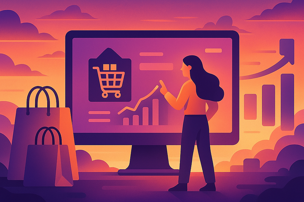


Comments